
by Gene Crawford | Sep 20, 2012 | Gallery
I like this website because it’s not overly fancy. It has a strong graphic punch and some neat visuals that have been clearly crafted by hand, like the timeline section. It’s a nice example of a website doing what it needs to do for you.
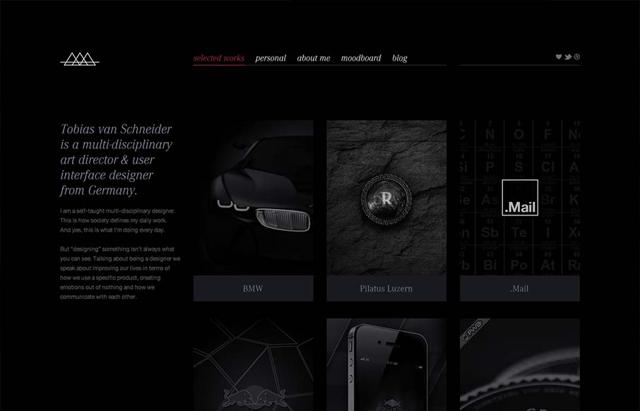
by Gene Crawford | Sep 19, 2012 | Gallery, Portfolio
I like the moody darkness of this website. The interaction of the X that loads over the work samples is nice and has a good feel to it as you mouse around. The mood board is a clever look into who this designer is and the blog is a superb minimal example IMHO. Love...
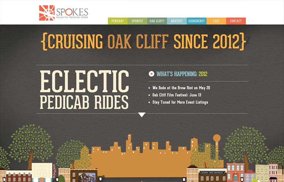
by Gene Crawford | Sep 19, 2012 | Gallery
Just a fantastic way to share the narrative of what a ‘pedi cab’ is and how it all works. Beautiful illustrations and scrolling based animations, just wonderful to look at.
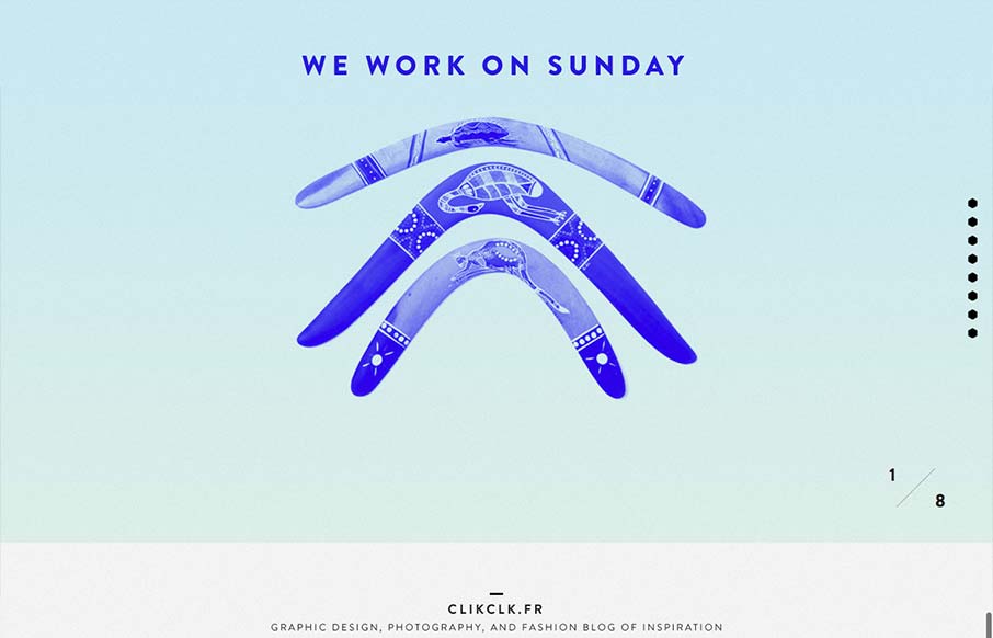
by Gene Crawford | Sep 19, 2012 | Gallery
Fun website! I like the duotone color look as well as the way the scrolling is designed. Also cool way to display the work, in the monitors like that, it’s not new to see but in this instance it feels fresh somehow – maybe it’s the boomerangs?
by Gene Crawford | Sep 18, 2012 | Gallery
There’s a lot to like about this design. The animation of the rows of houses spinning in a big circle like that is used perfectly in conjunction with the rest of the otherwise static feeling design. The design doesn’t beat you over the head with the...