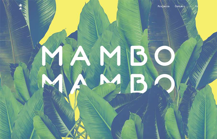
by Gene Crawford | Sep 2, 2015 | Gallery
Simple approach to this website, but I love it. I love the big header image, it’s fun and feels fresh. Then the rest of the content is really straight forward but probably all you need for a site like this.
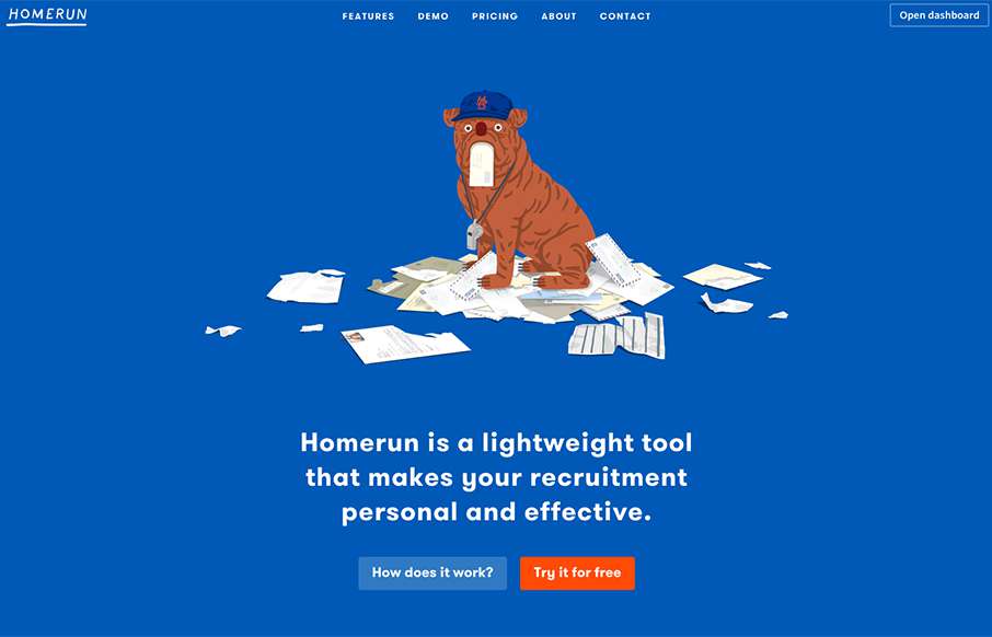
by Aaron Griswold | Sep 2, 2015 | Gallery
Love this simple site with some cool bulldog (kind of) flat illustrations. Besides liking the site – I really like the way the actual app looks and works – there is a Bootstrap element to it – but it’s clean and makes sense – even has...
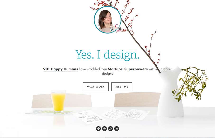
by Aaron Griswold | Aug 31, 2015 | Gallery, Portfolio
Good, clean, functional site from Raluca Comanescu out of of Romania for her Unfold Ateier site. It has a ton of detail on the content side, and I like the fact that there are different types of nav for a lot of content, instead of doing some type of filtered masonry...
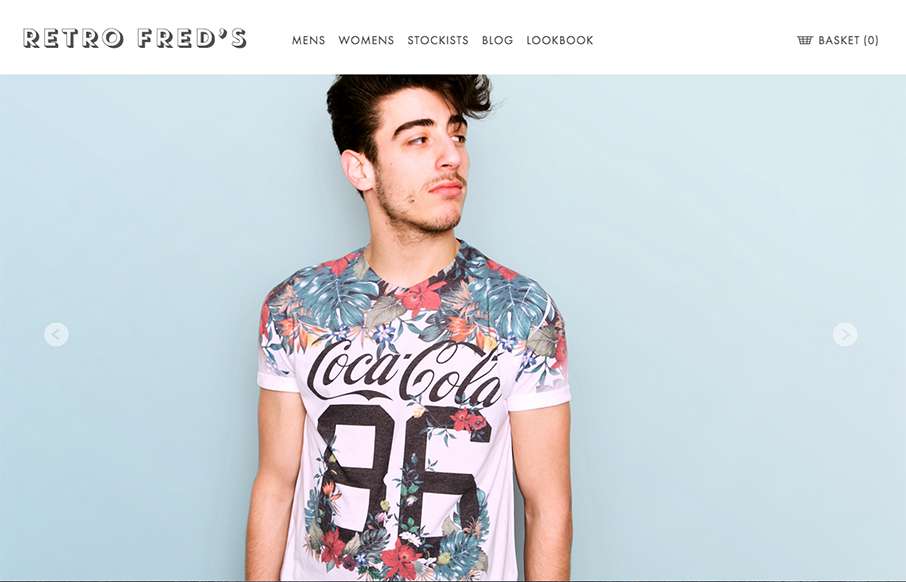
by Gene Crawford | Aug 25, 2015 | Fashion, Gallery, Shopping
I like the simplicity in the grid for this ecommerce site. It’s clean and simple and driven by the photography. I really like the way the main navigation is displayed open when you load it up on the mobile site width like that too. Smart stuff.
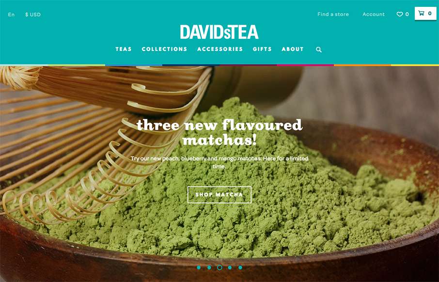
by John David Hunt | Aug 25, 2015 | Food and Beverage, Gallery, Shopping
This is a bright and lively site from David’s Tea out of Quebec. It’s incredibly detailed throughout the shopping part of the site – it looks like hundreds of items on the site – and all are beautifully done. My wife is a huge fan of Rooibos...