
by Aaron Griswold | Oct 19, 2015 | Entertainment, Gallery
Beautiful, flowing site from Chargefield out of Ontario, for the Mississauga Symphony Orchestra. With flat / material design and other design trends, we see less “textured” type backgrounds it feels like. They’ve done a good job of having the...
by Aaron Griswold | Oct 19, 2015 | Entertainment, Gallery
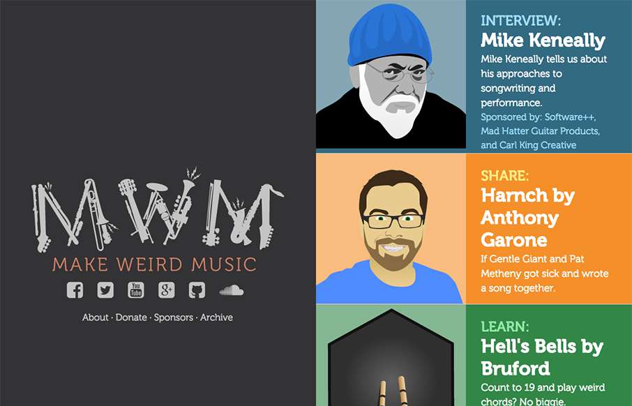
Good looking pet project site by Anthony Garone from Arizona, called Make Weird Music – interviews with musicians that make, well, weird music. Really like the split design, and illustrations. From the Designer: A 50/50 vertical split flexbox-based responsive...
by Aaron Griswold | Oct 15, 2015 | Gallery, Photography
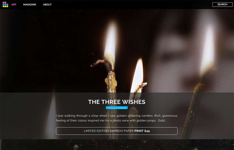
Looks like ArtSocket has changed it up a little since we reviewed them in January. They’ve continued to focus on the Art side, but making the experience a little more immersive with the full-width art scroll on the home page, and more detail on interior pages...
by Aaron Griswold | Oct 14, 2015 | Gallery
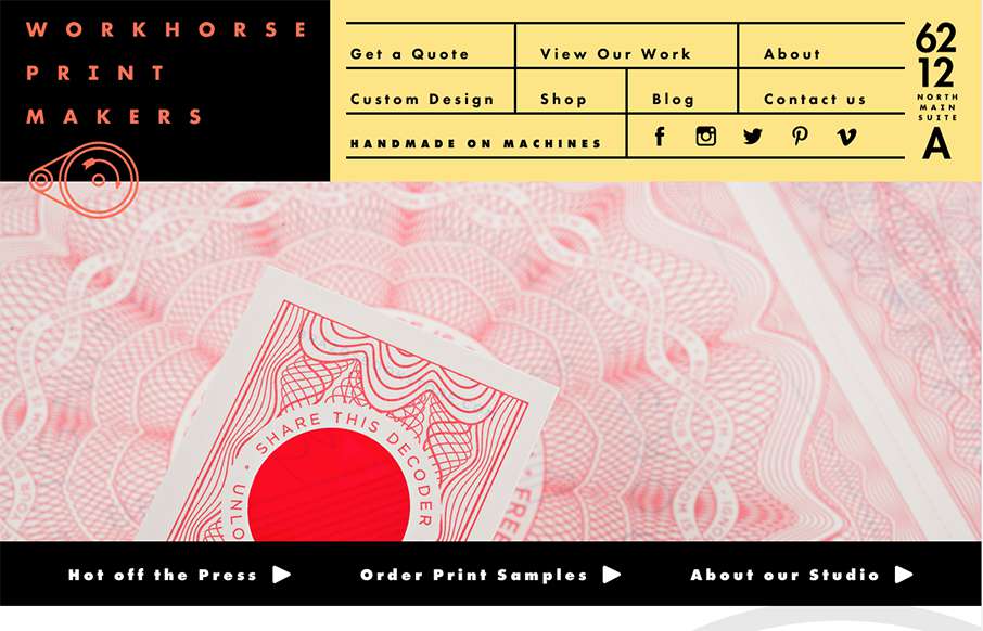
Hands down, the best navigation we’ve seen in a while in this site for Workhorse Printmakers, made by Spindletop out of Houston (think we’ve reviewed their site earlier this year too). Love this header nav block – definitely makes you think of a...

by Aaron Griswold | Oct 13, 2015 | Gallery
Sharp new site from Sequoia Capital out of Menlo Park. Like the intro image that leads down to the cool vertical slideshow, with great suped-up images, and a cool overlay on the left.