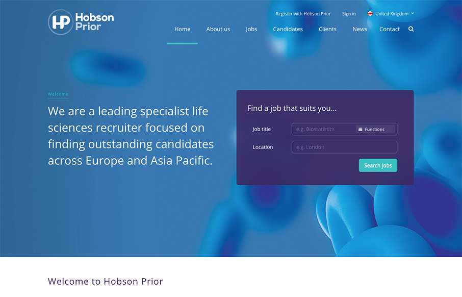
by Gene Crawford | Nov 10, 2015 | Gallery
I really dig the way the jobs search box is designed for this site. It’s first and foremost to the user and is simple and easy to understand before you even use it. Cool. I also like the responsive take on the design when you scale down to mobile screens as...
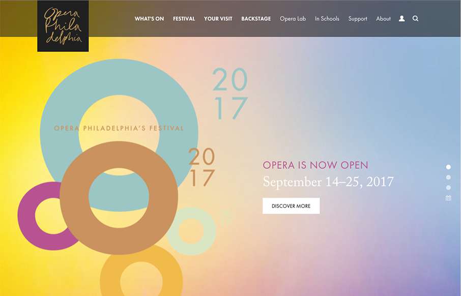
by Gene Crawford | Nov 9, 2015 | Entertainment, Gallery
Beautiful website overall. The single reason i’m reviewing it for the site here is the way they’ve made the main page “slider” most of the home page content as they have. It’s smart and I thoroughly enjoy this idea.
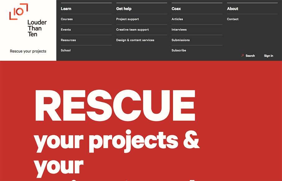
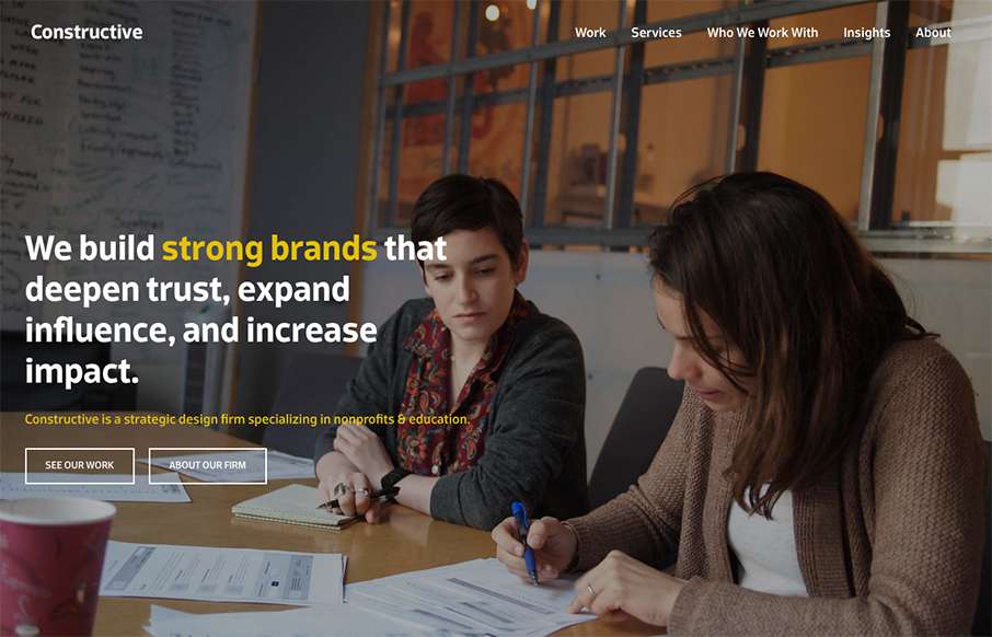
by Gene Crawford | Nov 5, 2015 | Gallery
Louder than Ten, the digital home of Rachel and Travis Gertz, is a wonderfully designed approach to a digital services company website. I love the thoughtfully placed main navigation, including it’s transformation on smaller screen widths, and the large and easy...
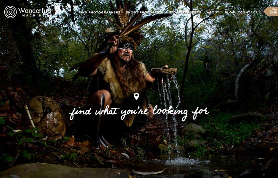
by Gene Crawford | Nov 4, 2015 | Gallery, Marketing
Wonderful Machine is a production company with a network of more than 700 highly curated commercial photographers worldwide. The site houses a photographer search used by agencies worldwide, and Wonderful Machine’s other services such as stock photo requests,...
by Gene Crawford | Nov 4, 2015 | Gallery
It’s a fairly standard approach to a layout but I dig it. I like the way the large splash image blends on top of the modular boxes below it. It feels fluid this way. Add in some decent responsive design and it makes for a great site.