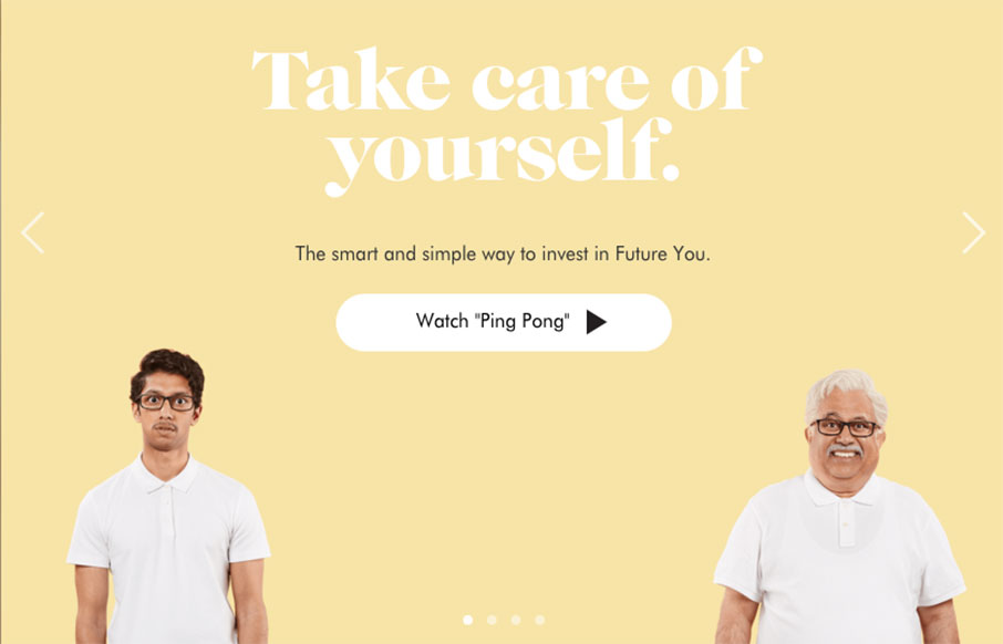
by Gene Crawford | Apr 6, 2016 | Gallery
Wealthsimple doesn’t look like any other financial website i’ve seen before. Ditching the status quo corporate colors for a softer more non-traditional vibe they really get it right. Playing up the personalization feel to the tee. I love the typography on...
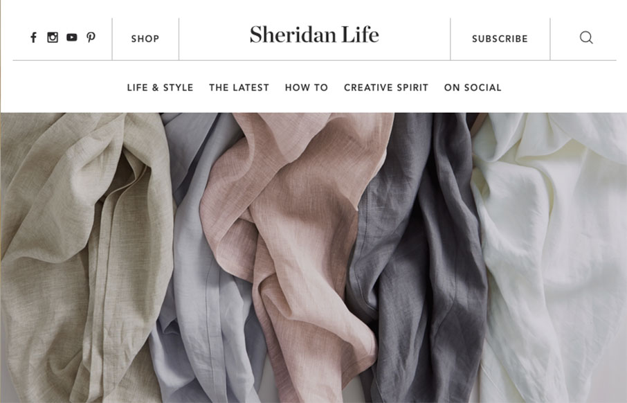
by Gene Crawford | Apr 5, 2016 | Gallery
The Sheridan Life life page of the Sheridan website is a super sweet page design buried inside the overall corporate website. It’s beautiful, great typography and great rhythm, I loved discovering this. My favorite interaction points are the header and the page...
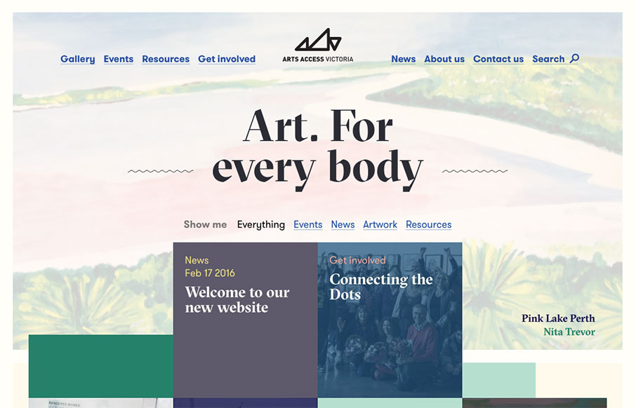
by Gene Crawford | Apr 5, 2016 | Education, Gallery
Generally intriguing and thought provoking layout to me. I love the asymmetry inherit in this layout. Balancing out a design with an offset approach like this is difficult but when done well is just beautiful. I think I actually love the simple blue + underlined links...
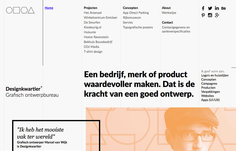
by Gene Crawford | Mar 30, 2016 | Design Firm, Gallery
Super strong grid based design. The layout and details feel very scandanavian to me. I love it so much. It’s not responsive, which is a shame but I still love it. From the Designer: Graphic design agency Designkwartier aka Marcel van Wijk one-man-designstudio...

by Gene Crawford | Mar 30, 2016 | Design Firm, Gallery
Really cool full width layout with a strong grid based. It’s made up of largely squares and the grid, it really is a strong layout, it feels kind of “traditional” to me but the type and colors make it look really futuristic. Real solid design here....