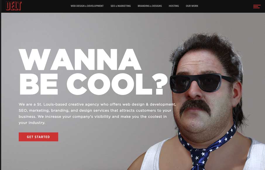
by Gene Crawford | Oct 28, 2016 | Gallery, Marketing Company
Fun imagery help deliver a pretty standard agency message and it works great. The best feature, once you get to it, is the fly-out nav. I love how it’s basically a small site map but they’ve also broken out the major areas of focus for the agency at the...
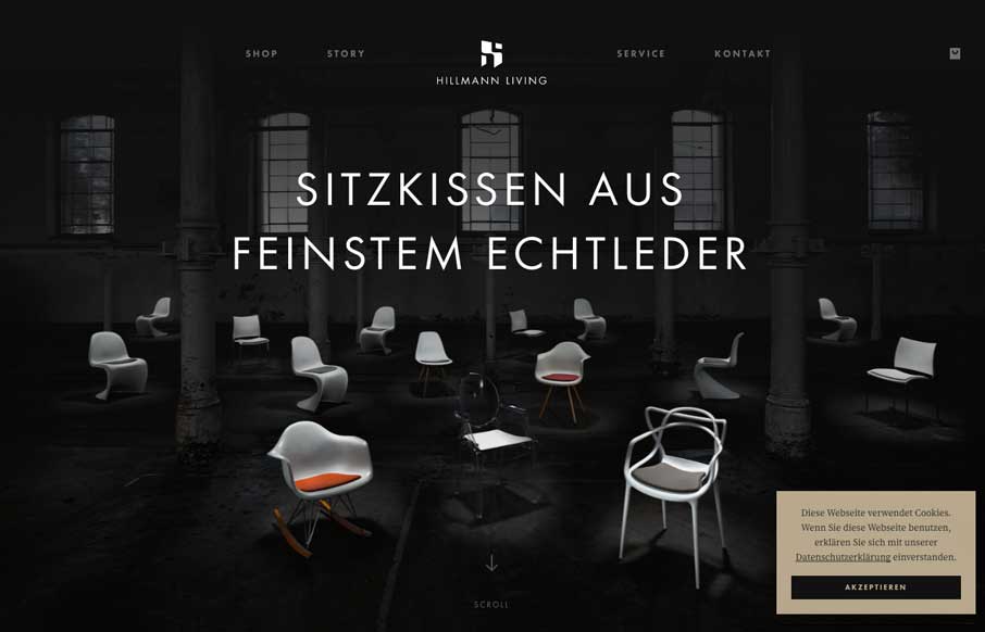
by Gene Crawford | Oct 26, 2016 | Gallery
Nice clean layout for the Hillman Living website. I love the way the image fades in with those color chairs on that dark background. Cool effect there. I also like the way the first section of product images are worked onto the page. It’s chock full of visual...
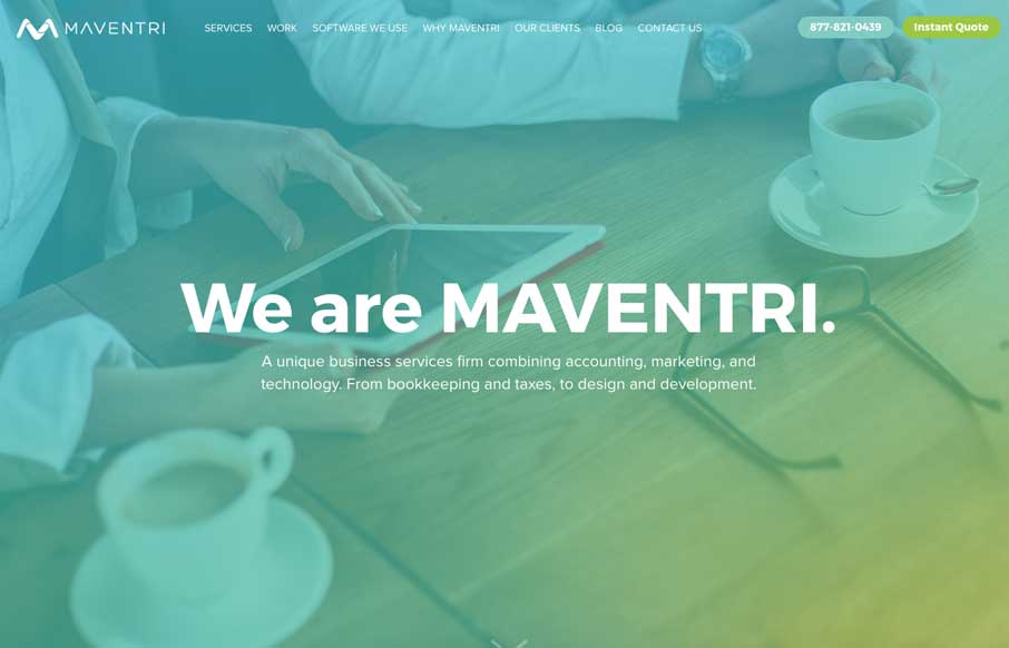
by Gene Crawford | Oct 25, 2016 | Gallery
This layout has the vibe of a theme but what’s been done with it regardless is nice. I love the color scheme here, it feels really new. I also dig the nice use of the case studies. From the Designer: We are a unique business services firm combining accounting,...
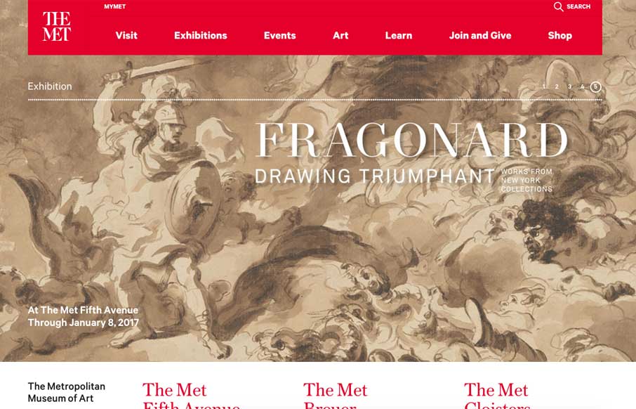
by Gene Crawford | Oct 21, 2016 | Education, Gallery
Nice rework of the Met Museum by Fi interactive. I’ve been following their work since the pre-flash and through the flash era of the internet. I’m glad to see they’re still kicking and doing fantastic work. Mobile was a big focus Right “off course it...
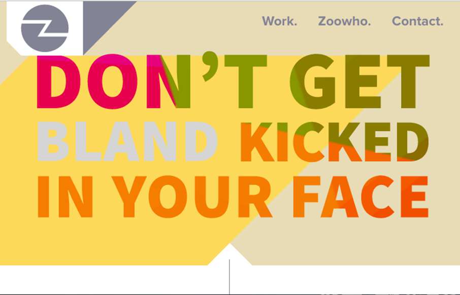
by Gene Crawford | Sep 12, 2016 | Gallery
Pretty cool, just mostly a single column layout. There’s some cool mouse-over type interaction on the large imagery that make up the case-study sections. Love it. From the Designer: Lovingly curated portfolio of Zoocreative, an Irish design studio that...