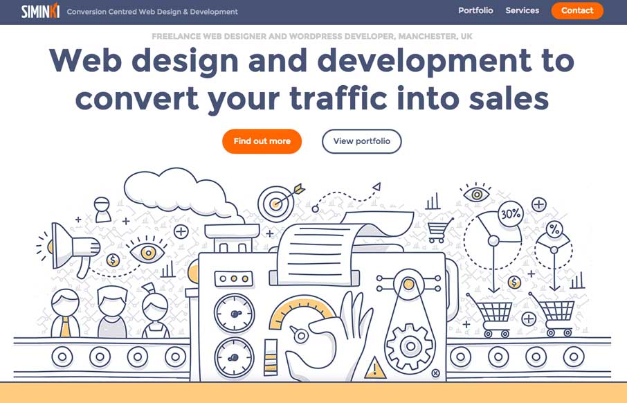
by Gene Crawford | Feb 13, 2017 | Gallery
Putting this in the gallery because I love the illustration work. The line work is cool and it’s inviting. The way the’ve weaved in the illustration with the rest of the page design is stellar work too.
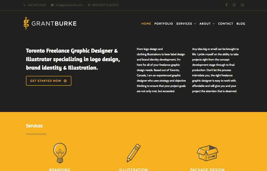
by Gene Crawford | Feb 13, 2017 | Gallery, Portfolio
Neat interaction work here for Grant Burke’s website. I like how the header/logo/nav changes around as you scroll. Nifty color choices too. The thing I love most is the multi-column layout for wider screens. You simply don’t see that often and when I see...
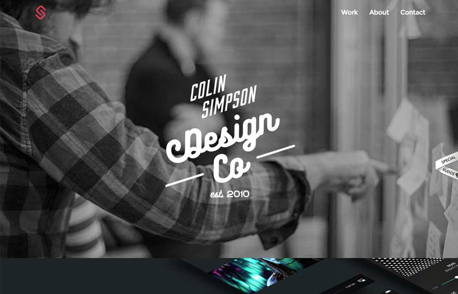
by Gene Crawford | Nov 4, 2016 | Gallery, Portfolio
Love, love the typography on that logo mark. I also dig the big shots of the work, putting things in context like that, brilliant. From the Designer: The portfolio of Colin Simpson a UX designer from San Diego who helps elevate experiences for big and small brands...
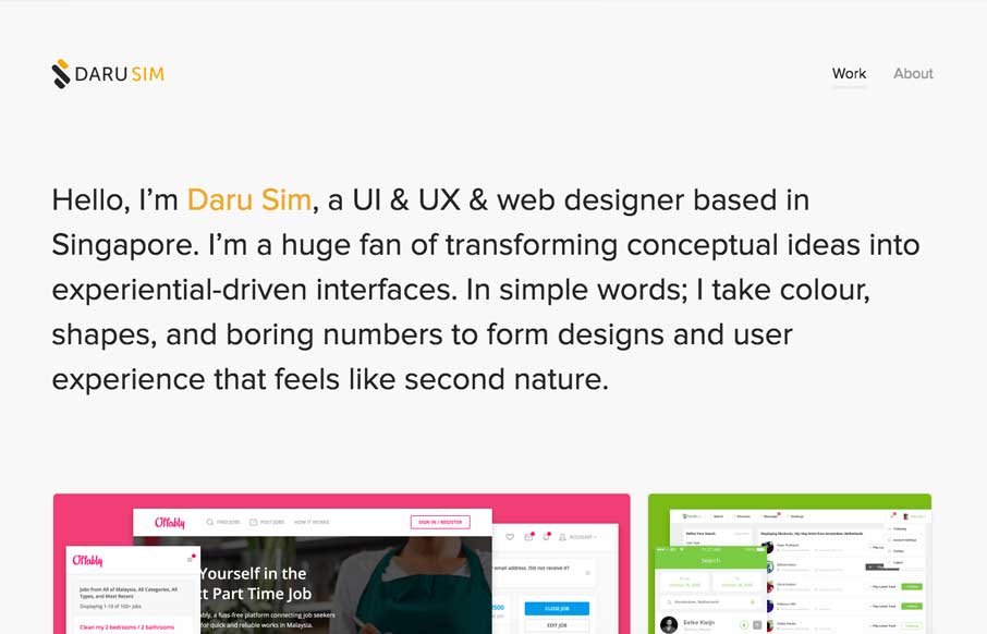
by Gene Crawford | Nov 3, 2016 | Gallery, Portfolio
Simple and effective. You can beat a one – two punch like that. This website embody’s that in every way. From the Designer: It’s almost the end of 2016 and I thought that its time to revamp my personal website (v3.0) and yay, I’ve done again...
by Gene Crawford | Nov 3, 2016 | Gallery
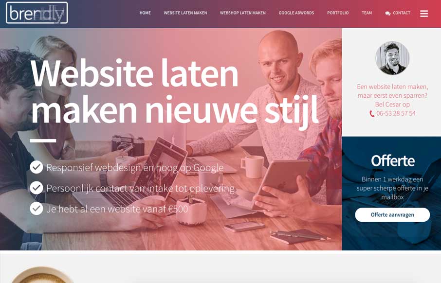
Pretty good layout, it keeps you moving your eyes around but on the right stuff. I also like how they’ve humanized certain areas like the contact us part, with a picture of one their team. Strong thinking here. From the Designer: We are a webdesign agency. The...