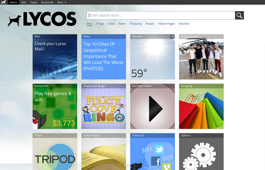
by Gene Crawford | Apr 9, 2012 | Entertainment, Gallery
The new Lycos website is interesting. It’s primary use is the deliver the search field and also has a large grid of selections for different stuff you can do. Like news feeds and video feeds, etc… I like that it’s responsive a lot, honestly...
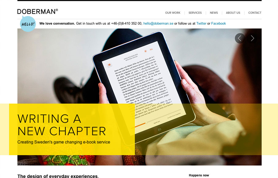
by Gene Crawford | Apr 5, 2012 | Gallery
I really dig the hierarchy designed into this home page. The large image/slideshow is nice with nice details and you get t focus on that, with simple messages and then as you scroll down the info gets more densely populated and then eventually just some basic about...
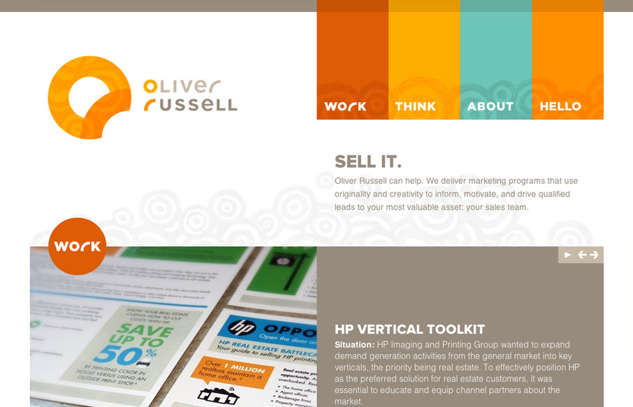
by Gene Crawford | Apr 5, 2012 | Gallery
I like the two main column layout for this website. The use of the circles and overall blocky feeling of the design makes for a nice contrast, especially with the circular swirly pattern behind the main elements. The responsive design for this site is pretty well...

by Gene Crawford | Apr 4, 2012 | Gallery
The Mischief Co’s visual branding is quite fun. It’s somewhere between olde school and future classy (heh, I just made that up.) But I love it, it’s fun and that’s just what a site like this needs right? Technically it’s put together well...

by Gene Crawford | Mar 28, 2012 | Gallery
Very tight design. I like the animated background image around the logo/illustration. I particularly like the effectiveness of the footer area/contact form. The experience of going from page to page and getting the slide down effect is pretty cool, but gets a bit...