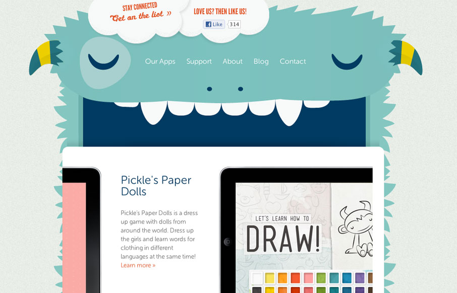
by Gene Crawford | Apr 17, 2012 | Gallery
The Playtend website is just pain fun. I love the monster and how it all ties in with the name. Taking a look at it in our screen cast review Giovanni and I spell out how much we enjoy this website.
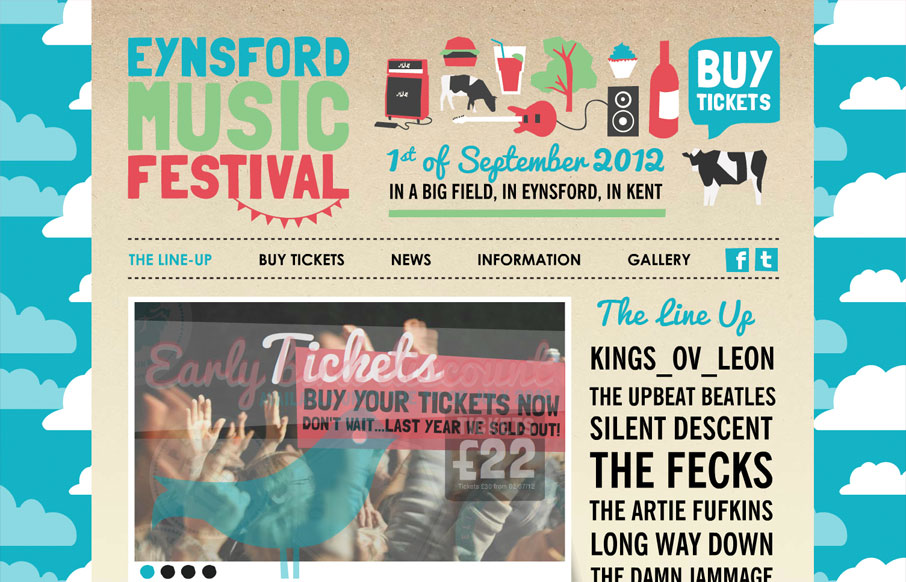
by Gene Crawford | Apr 17, 2012 | Entertainment, Gallery
Largely a simple execution technically speaking but visually it’s super fun. I love the illustration style and the visual stories each little drawing tells to help further the overall story of location and experience. The type is also pretty much spot on with...
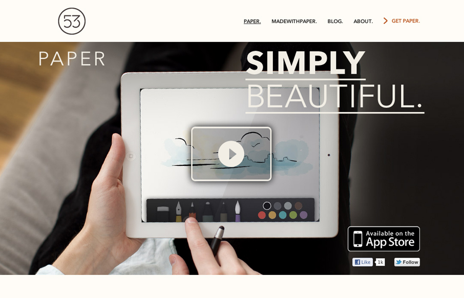
by Gene Crawford | Apr 12, 2012 | Gallery
The Paper app home page is actually a sub page of the FiftyThree website. It’s gorgeously clean and simple though. I absolutely love how the images and copy flow down the page being strongly gridded out but yet almost asymmetrical at the same time.
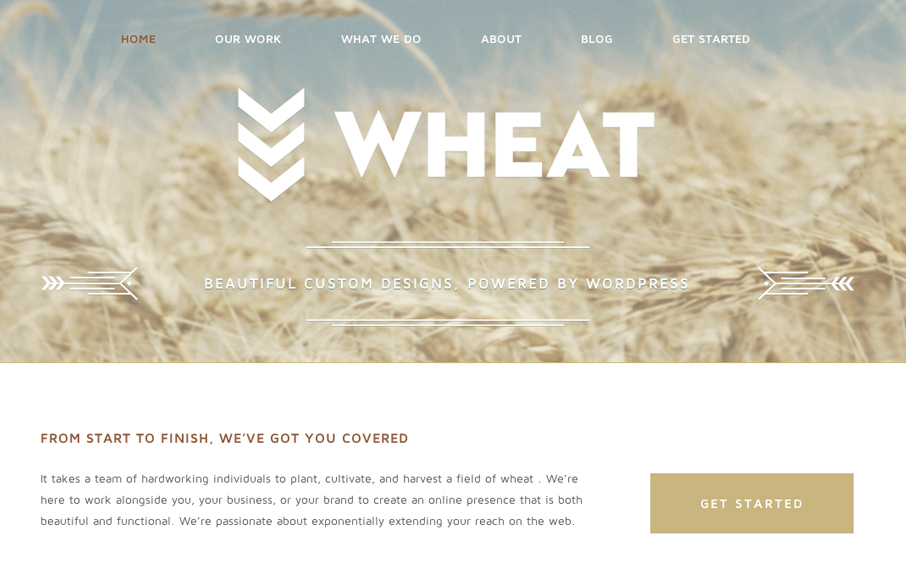
by Gene Crawford | Apr 12, 2012 | Design Firm, Gallery
Just a beautiful design, simple as that. I love the big bold image of the wheat and the large WHEAT set on top of it. Subtle yet not at all. The rest of the site is a display of restraint by the designer, which shows maturity to me. Love it.
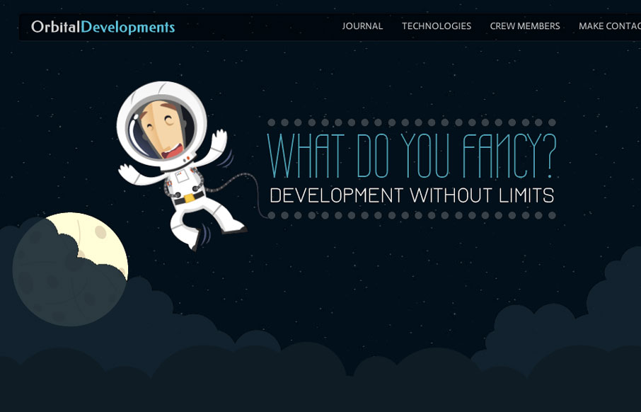
by Gene Crawford | Apr 10, 2012 | Gallery, Screencast Review
Love the Orbital Developments site design. It’s fun and functional. I really dig the responsive approach and some of the finer details. Like the moon and slight astronaut animation. Gio and I dig in with our screen cast review, give it a watch and tell us what...