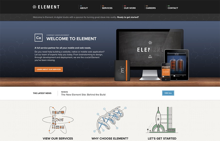
by Maria | Oct 16, 2012 | Gallery
Element has just launched a really well done site. It has all the fancy bells and whistles of a hero carousel, responsive design, and snazzy graphics. What I really appreciate though is how overall what they’ve done is create a mature and solid brand experience....
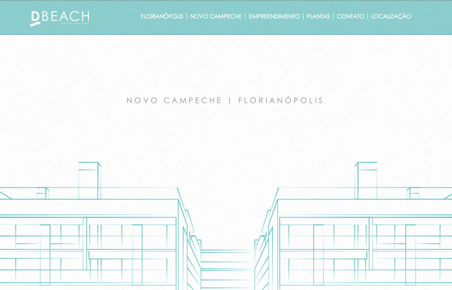
by Gene Crawford | Oct 15, 2012 | Gallery
Very intense parallax design. Lots of movement and photos flying around, it’s almost too much. But in the end it’s a nice design and execution. D’Beach building parallax website – developed for those who want to live in a beautiful place near...
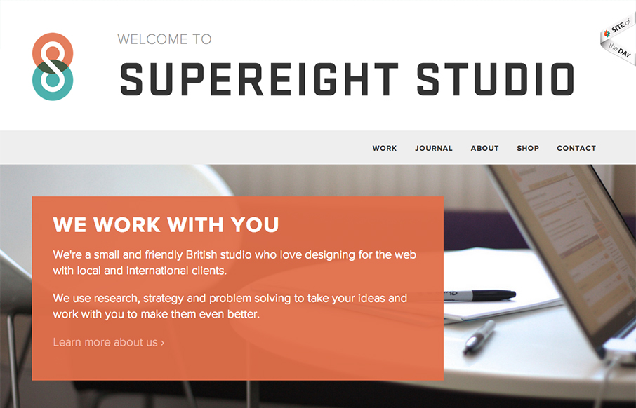
by Gene Crawford | Oct 15, 2012 | Gallery
Submitted by: Matt Hamm @matthamm Role: Designer & Developer It’s our newly designed responsive website. It’s been 2 years in the pipeline. We hope you like it! Solid responsive design. I’d say two years work is worth it for such a clean and...
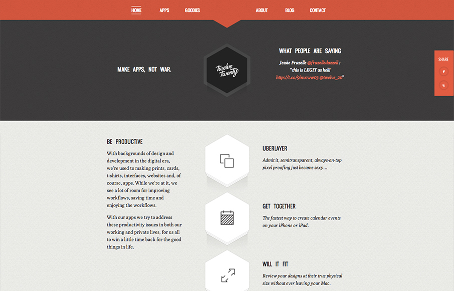
by Gene Crawford | Oct 12, 2012 | Gallery
Really tightly designed website for Twelve Twenty. The little interactions that happen when you mouse over the icons are nice and keep you interested. The overall sharpness and minimal approach of the design mixed with limited color palette make it kind of stick...
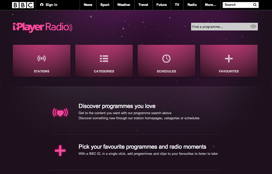
by Gene Crawford | Oct 12, 2012 | Entertainment, Gallery
Well, well, well: looks like the BBC Radio site’s just launched a fine-lookin’ responsive site. bbc.co.uk/radio/ /via @paulrobertlloyd— Responsive Design (@RWD) October 8, 2012 While this isn’t a typical “website” it’s still worthy of...