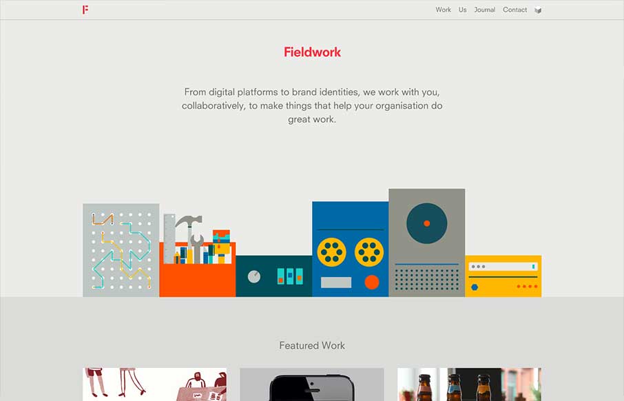
by Gene Crawford | May 22, 2013 | Gallery
What a beautiful site Fieldwork is. It’s so simple yet full of detail. I love the soft transition between pages, which I can’t see working on another site as well as here. Then each page while similar is just a bit different enough to show it’s all...
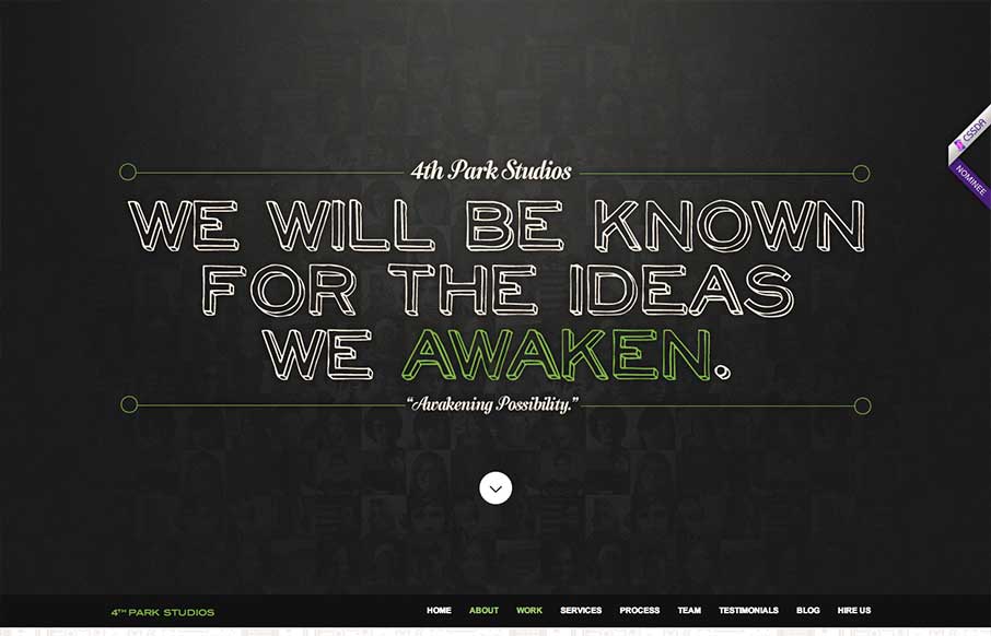
by Gene Crawford | May 22, 2013 | Gallery
The 4th Park Studios site is a great design. There’s a great feeling for timing as you scroll down the page, which makes it feel very complete. The site looks like it’s based on this theme, but they’ve changed it out and used it as a base. Overall...
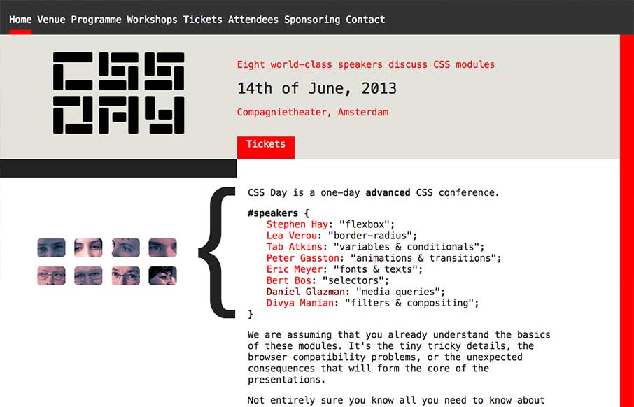
by Gene Crawford | May 21, 2013 | Conference, Gallery
What a great simple concept for a conference website. It’s super appropriately designed for the audience and for the subject matter. I LOVE stuff like this. I’ll also let Cameron Moll’s quote do the explanin’: Also, click the speaker’s...
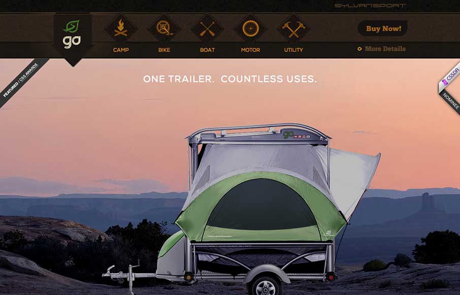
by Gene Crawford | May 16, 2013 | Gallery, Sports/Recreation
Submitted by: Justin Bernard @fleeangrybear Role: Designer & Developer Damn, I love detail like this. The slight parallax on each image of the products down the the animations on the main navigation before you scroll it to the fixed layout spot. Lovely. The...

by Giovanni DiFeterici | May 15, 2013 | Gallery
Hopskoch is joyful and simple. It’s subtle animations are perfectly appropriate for selling the brand and pair nicely with the easter color palette. I really dig how the main product image scrolls up a little and fades out as you scroll down the page and the...