
by Gene Crawford | May 30, 2013 | Gallery, Portfolio
I think what I like most about this design is that it’s “flat” – just kidding. Was that funny? Seriously, what I like most is the vertical rhythm of the site as you scroll down. The way the pieces of the layout are positioned feel very nice and...
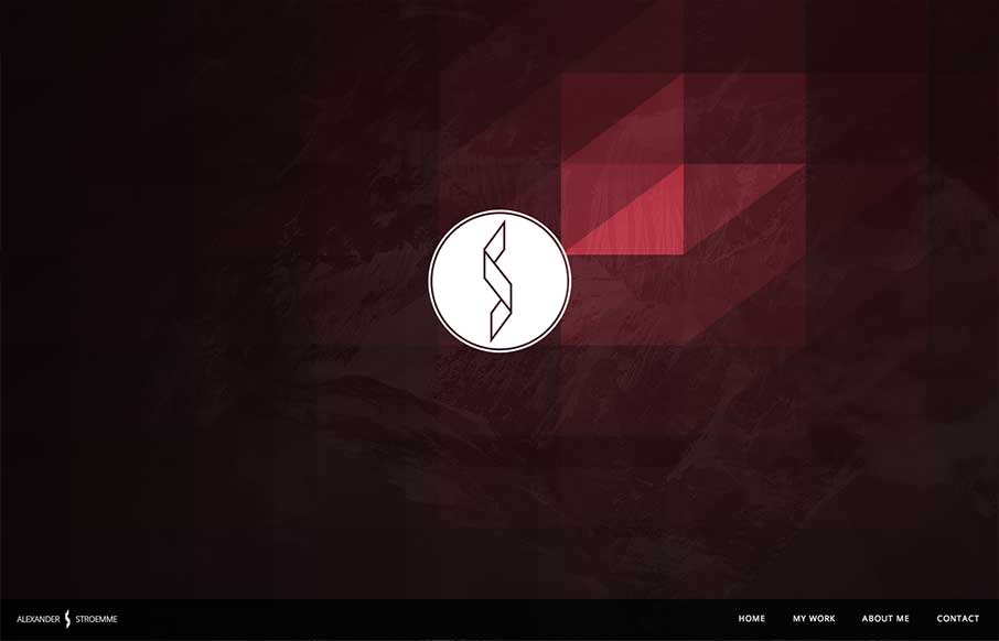
by Gene Crawford | May 29, 2013 | Design Firm, Gallery
Pretty cool look with the scroll effect (dare I call it a parallax?). I also like the monochromatic palette for the layout with the full color images blocked in.
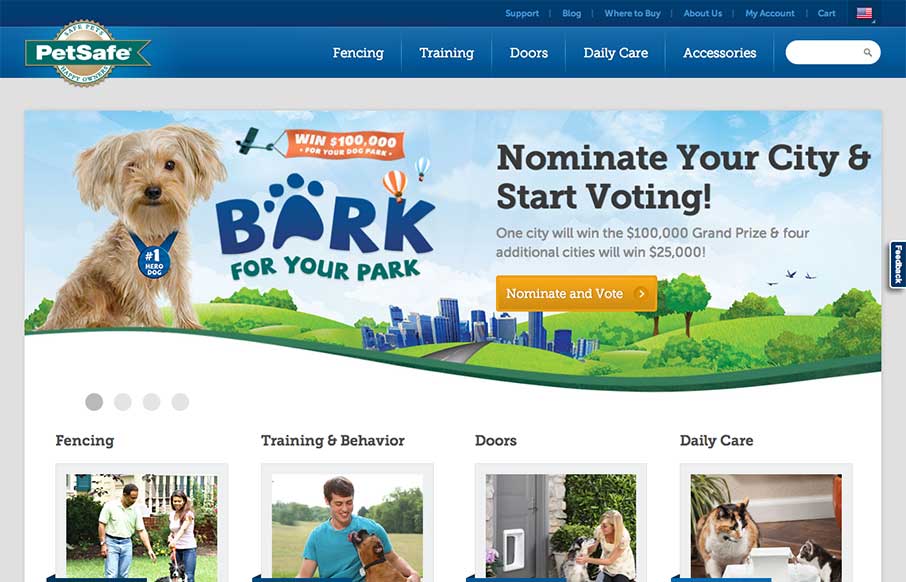
by Maria | May 28, 2013 | Gallery, Shopping
Really stoked to see the new PetSafe site launched. @bold did all the #RWD and CMS buildout.d.pr/ZPlu — Noah Stokes (@motherfuton) May 15, 2013 Really great larger commercial example of a responsive solution working great. I particularly like how this site...
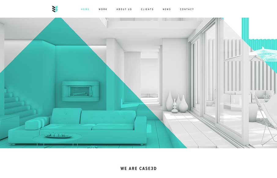
by Gene Crawford | May 23, 2013 | Gallery, Portfolio
I’m seeing a few new design trends like this one, where there’s basically a splash page but it’s executed as an oversized header area. Pretty clever, like this one, which reminds me of a cylon’s eye for some reason. That alone is enough to make...
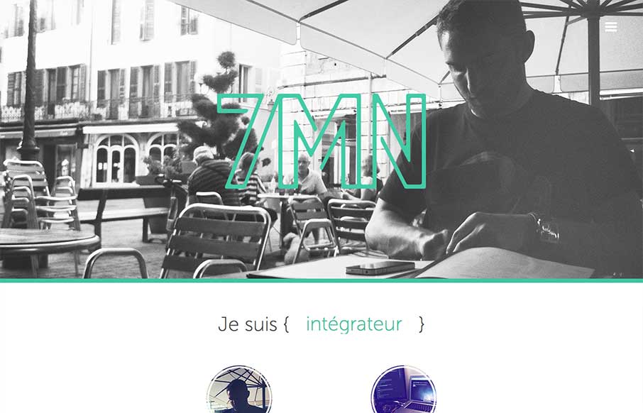
by Gene Crawford | May 23, 2013 | Gallery
Pretty cool single page website design. The way there is a slight parallax feel to the header, then the way the nav slides into place is very well done. I also like the simple different views designed for the smaller screen widths. My favorite is the green color and...