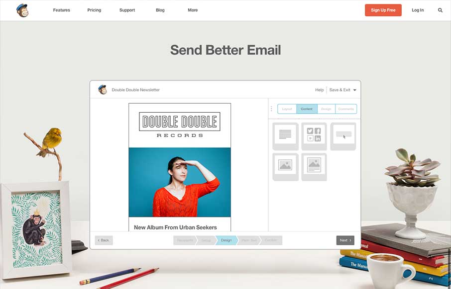
by Gene Crawford | Jul 8, 2013 | Email Newsletter, Gallery
The new Mailchimp site is superb to say the least. The simplified layout on the homepage really sets the tone for the rest of the design. Incorporating the video of how the app works into the homepage like this is smart and works very seamlessly, you almost...
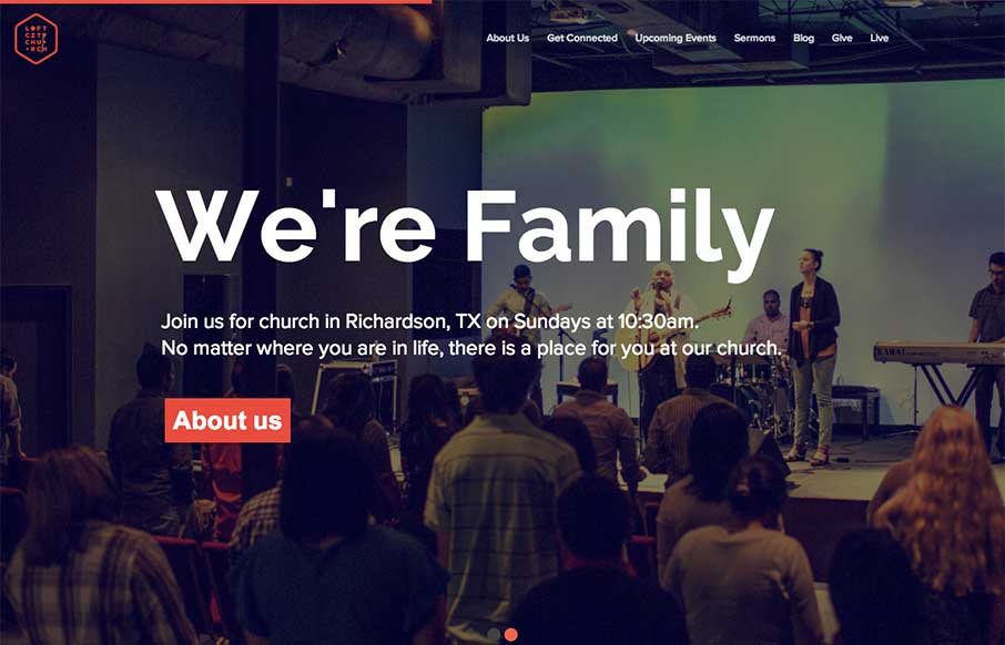
by Giovanni DiFeterici | Jun 24, 2013 | Gallery, Nonprofit
The loftcitychurch site strikes a wonderful balace between it’s use of images, typography and color. At large screen sizes the site feels big and open, which is perfect for a church, and at mobile sizes everything feels compact but not cramped. The use of fixed...
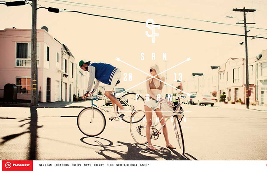
by Giovanni DiFeterici | Jun 20, 2013 | Gallery
House is strongly structured, albe it a little noisy design. The strong use of bold red and imposing lines is wonderfully graphic and paires well with the style of photography. The site is adaptive, which seems to work well enough in this case. Dig it.
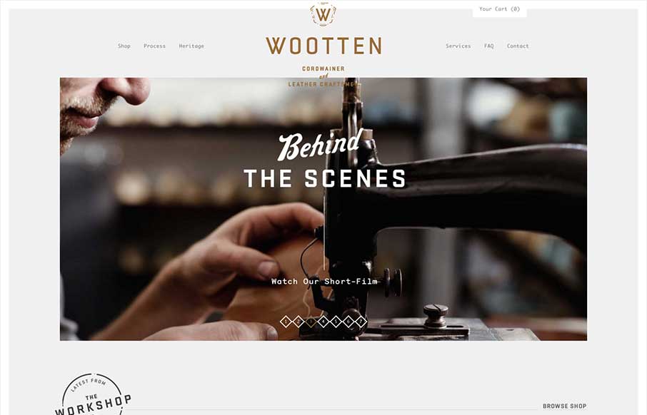
by Giovanni DiFeterici | Jun 19, 2013 | Gallery
Man this is a beautiful site. The photography really sells it. Just check out the heritage page. The mix of fixed imagery and scrolling text is beautiful and the transition between content blocks is perfect. The site has a handcrafted feel that perfectly compliments...
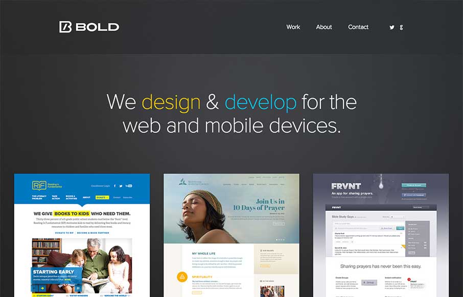
by Gene Crawford | Jun 19, 2013 | Gallery
So excited to announce our new, responsive @bold site:hellobold.com#rwd #mfn— Noah Stokes (@motherfuton) June 7, 2013 Really great looking simple approach. I love it so much. Good responsive design and great decisions on how they present their work. It’s...