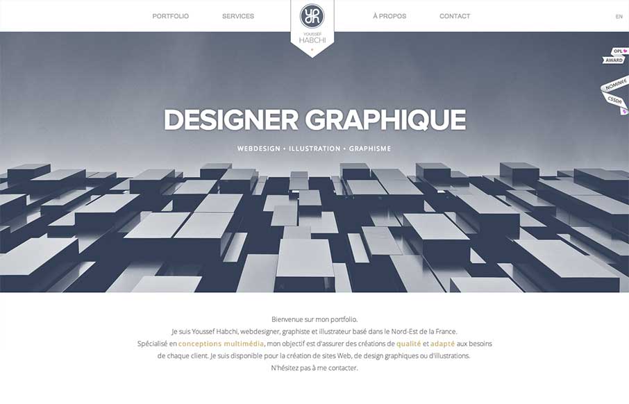
by Giovanni DiFeterici | Jul 15, 2013 | Gallery, Portfolio
While I’m not a hug fan of loading screens, youssef-habchi.com is a really nice responsive portfolio site. It balances low contrast grays beautifully and incorporates a fast, animated transitions that polish the interactions nicely. The splashes of color in the...
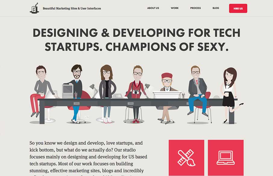
by Giovanni DiFeterici | Jul 11, 2013 | Gallery
The Simple as Milk website packs a lot onto one page! The site is strongly illustrative, which is perfect, one you see the portfolio; you certainly know what you are getting when you hire this agency. I really enjoy the playful quality of the artwork and interface...
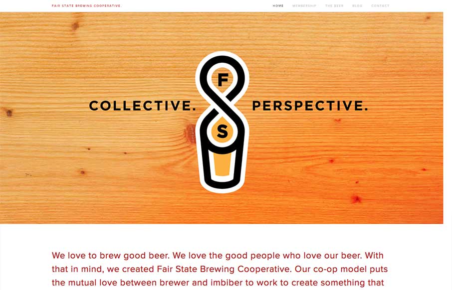
by Giovanni DiFeterici | Jul 10, 2013 | Gallery
Fair State Co-op is a really nice site filled with warmth and dominated by a simple graphic style. The site doesn’t have all the bells and whistles that we often see in the gallery, but its got rock solid design and readability. It’s a very friendly...
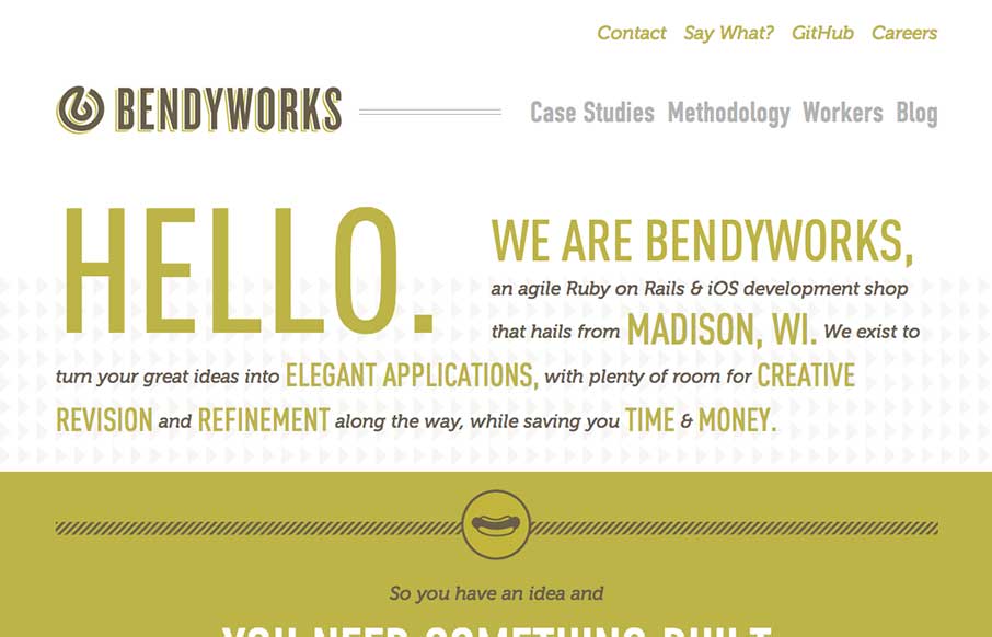
by Gene Crawford | Jul 9, 2013 | Gallery
I really dig the simple yet clever design of the Bendyworks website. It’s largely made up of text, but it’s well written and clearly defines what Bendyworks does for you and what they’re looking to do. I also really love the hot dog graphic, who...

by Gene Crawford | Jul 9, 2013 | Gallery
The updated Squarespace website design starts off with a homepage that’s pretty much just a giant slider. It’s a super clean, sleek and beautiful design across the board for sure. One question I have about it though, and i’ve seen this on a lot of...