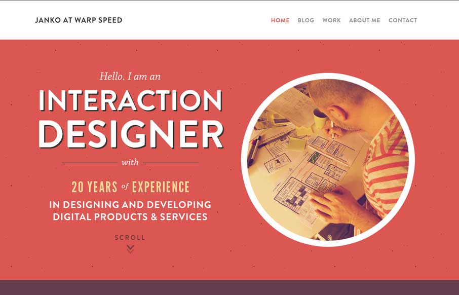
by Aaron Griswold | Jul 28, 2014 | Gallery
Hallo Janko! You probably know we see a lot of portfolio sites from graphic and web designers, but not as much from interaction / dashboard designers and developers (if that is a separate category). Janko’s site has a cool feel to it, and in the Works area, you...
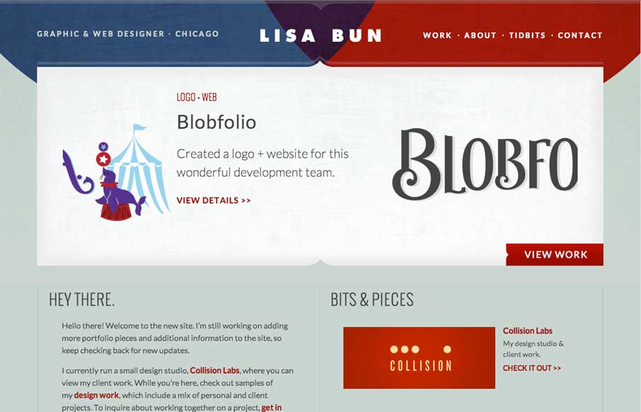
by Aaron Griswold | Jul 28, 2014 | Gallery
Cool to see portfolio sites from graphic designers. They always put a little more into the aesthetic design of the site like Lisa has. Fits with her motto of “Be Creative, Keep it Simple”. This is the website and portfolio of Lisa Bun, a graphic and web...
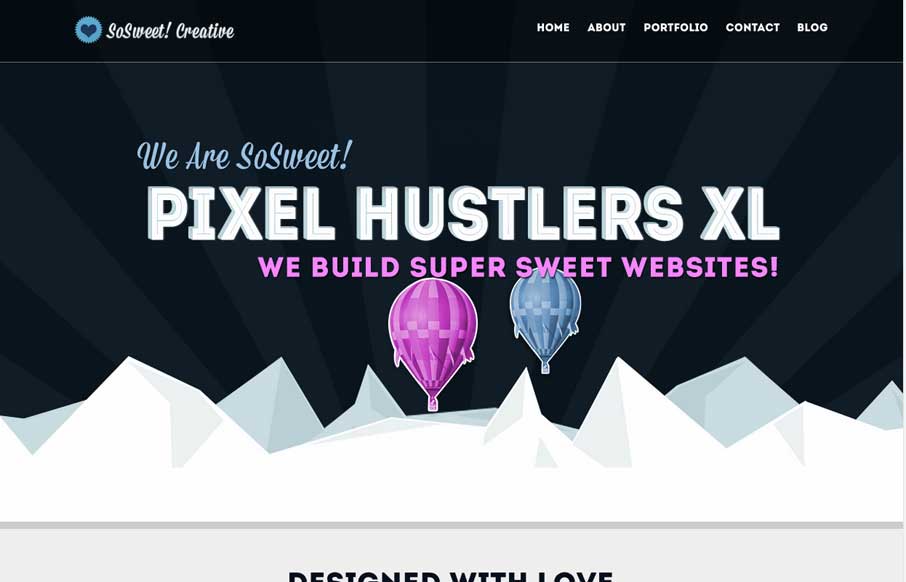
by Gene Crawford | Jul 25, 2014 | Gallery
Nice strong colors and graphic feel to this design. I really like the beating heart when the page loads up. I extra dig the way the contact form loads in too, nice touch. Submitted by: Stephen Scaff @SoSweetCreative Role: Designer & Developer SoSweet! Creative is...

by Gene Crawford | Jul 25, 2014 | Gallery
Just a really clean and nicely subdued site design for a designer. I like it much. Submitted by: Christopher Ware @christopherware Role: Designer & Developer
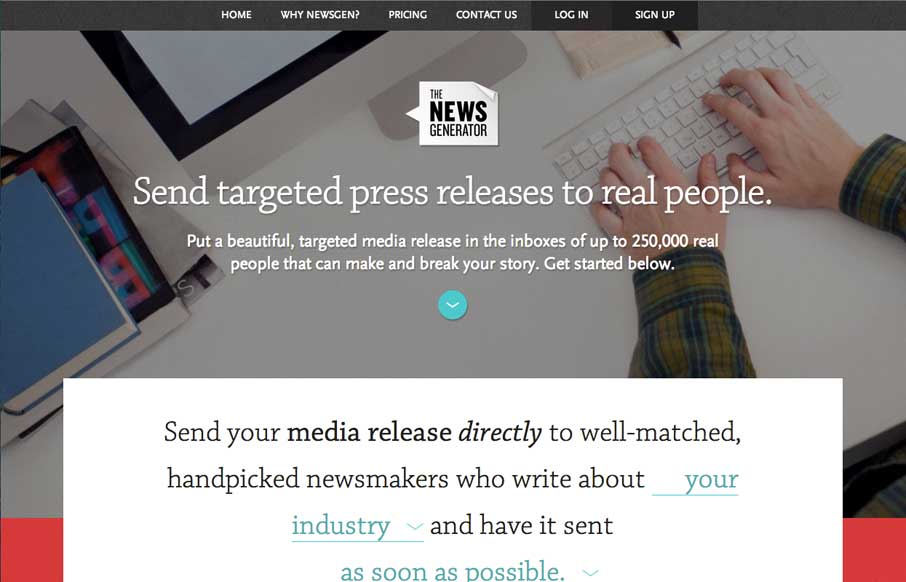
by Gene Crawford | Jul 25, 2014 | Gallery
Nice layout, it uses a lot of tried and true layout but it just feels a little different to me. I really dig the way the main signup form is right in the center of the home page but not in your face at the same time. Some clever form field design to go along with it...