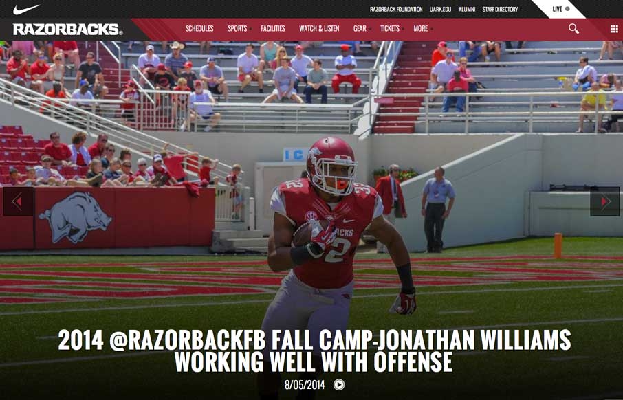
by Aaron Griswold | Aug 6, 2014 | Gallery, Sports/Recreation
Football (Gridiron) season is in a couple of weeks. Even though this isn’t my favorite team, really like their website. The large images and videos give it a bold and loud feeling, that translates really well if you’re a fan.
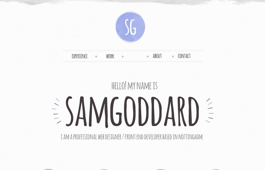
by Gene Crawford | Aug 5, 2014 | Gallery
Cool portfolio site that looks like Sam is into trying out new stuff – including some nice animations and icon work. Like in the Work areas how he specifically refers to what skills he used per project, instead of a nebulous skill set dashboard like most...
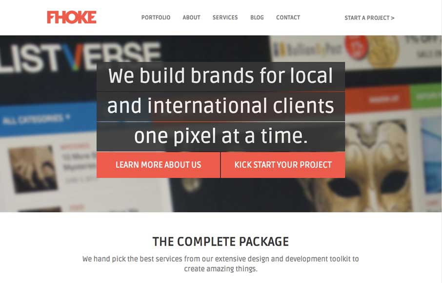
by Aaron Griswold | Aug 4, 2014 | Design Firm, Gallery
We’ve reviewed some of FHoke’s work before (i.e., Judgement Day) so cool that we get a look at their agency site. Really like the interaction of the jQuery masonry on the Portfolio page (we did this for a client recently – not as easy as it looks to...
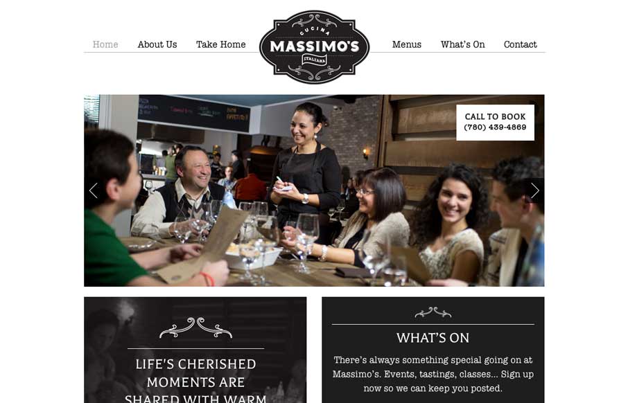
by Gene Crawford | Jul 29, 2014 | Food and Beverage, Gallery
We love websites that make great use of fonts, and Massimo’s Cucina Italiana uses a couple of different fonts, accent illustrations, vibrant pictures, and black, white, and gray to tell the story of their restaurant. Simple, and effective. Submitted by: Landon...
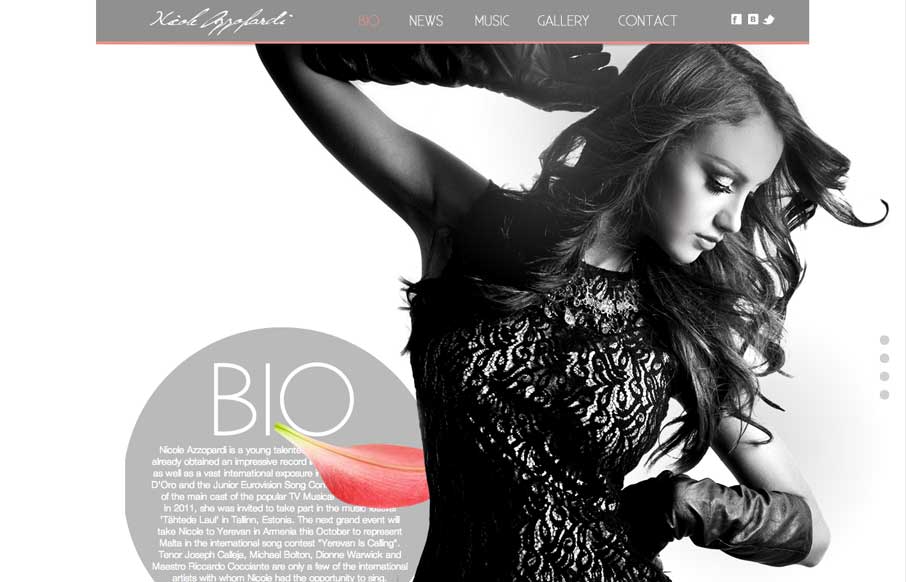
by Aaron Griswold | Jul 29, 2014 | Entertainment, Gallery
Great use of parallax with flying flower petals, bios, and a singer. Also like the use of texture in one of the sections, and then subtler parallax in another section to give some differentiation. Submitted by: Justin Sammut Role: Designer