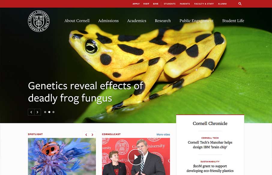
by Gene Crawford | Aug 14, 2014 | Education, Gallery
One of the better responsive higher ed site’s i’ve ever reviewed. There’s tons of nice design patterns in play here as well as other detail work. What’s most striking is that the responsive design isn’t just the home page, but seems to go...
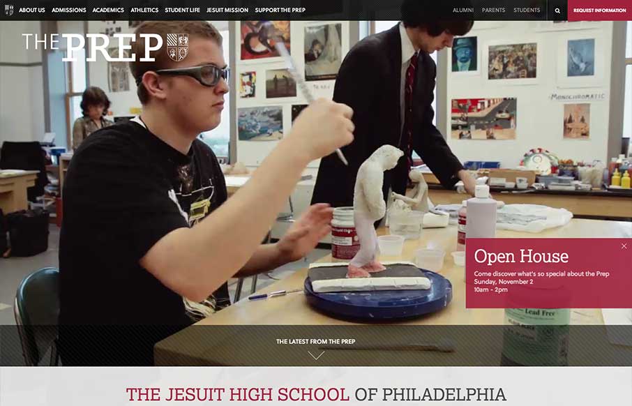
by Gene Crawford | Aug 12, 2014 | Education, Gallery
The St. Joseph’s Prep website is quite nice. I like the video background and how when the page scales down to smaller widths they swap out for a static image and then down to nothing for mobile devices. Nice strong easy to scan grid design too. Looks to be...

by Aaron Griswold | Aug 8, 2014 | Gallery
The things I would have said about Konnu’s website were exactly what their founder said about it (below). Added to what he said, I like how the navigation works in the mobile version – gives it a little of the current app navigation feel. Submitted by: Tim...

by Aaron Griswold | Aug 7, 2014 | Gallery
Christiana Bardeanu’s portfolio site shows off her work, and probably shows off a little of who she is a human too. She has her portfolio of work page which is good, but pay special attention to the floral background images – then go to her blog, and...
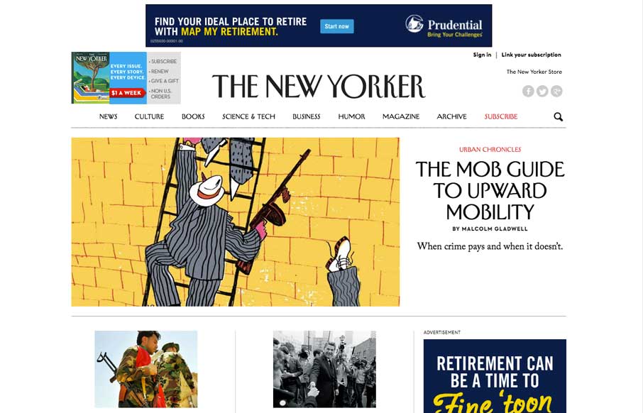
by Aaron Griswold | Aug 6, 2014 | Gallery
We’ve watched over the years as purveyors of print have made uneasy transitions to the web. Last week, the redesign The New Yorker’s website shows they’ve worked hard to translate their magazine into the modern interwebs. Great use of the images and...