by Gene Crawford | Oct 16, 2014 | Gallery
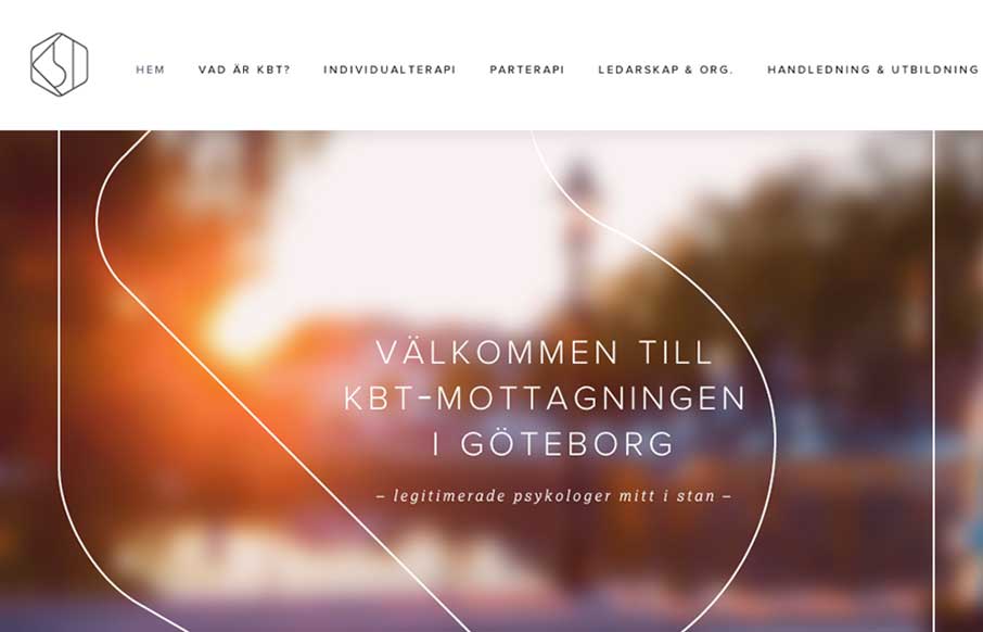
What a great visual mark; the KBT logo. I’m probably biased, since I love everything Swedish. But man it’s hot. I love the light feel to the design and the colors throughout. I do wish it was responsive, but it’s hard to tell sometimes how old a site...
by Gene Crawford | Oct 15, 2014 | Gallery
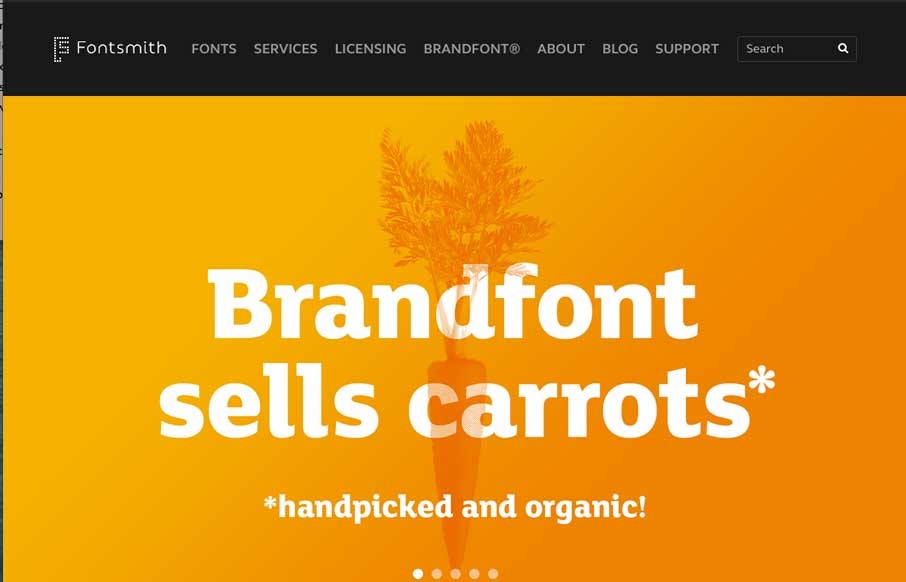
Very clean and simple design but very effective. Especially for font websites brevity is clarity. Luuurrve this.

by Gene Crawford | Oct 13, 2014 | Gallery
Super strong colors and bold graphics define the Slice Jack site design in a good way. I really dig the scroll animation of the axe too.
by Gene Crawford | Oct 9, 2014 | Gallery
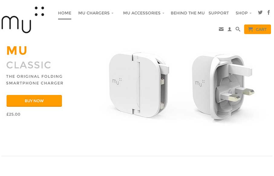
Very nice clean layout for mu the folding smartphone charger. Like the product design the website design echos the design ethos. I love that.
by Gene Crawford | Oct 9, 2014 | Design Firm, Gallery, Marketing Company
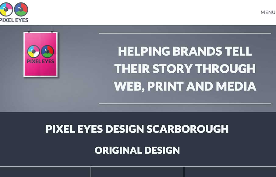
Nice little details here, like the way the main nav scales down in size as you scroll down and then comes back as you scroll back up. Nice grid layout with some bold graphics and overlay interactions. This is our digital design agency website. I wanted to utilise all...
