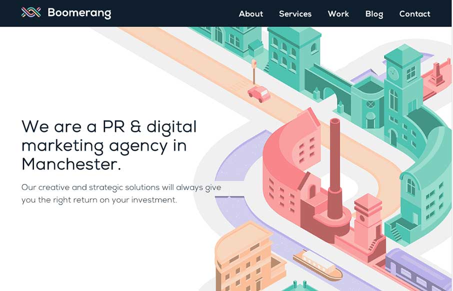
by Gene Crawford | Oct 21, 2014 | Gallery, Marketing Company
The visual style of this site is really slick. I love the colors and vector icon work as well as that main illustration/animation of the factory. Smart, smart work here. Event the pictures have been color corrected to fit into the overall colors of the page, subtle,...
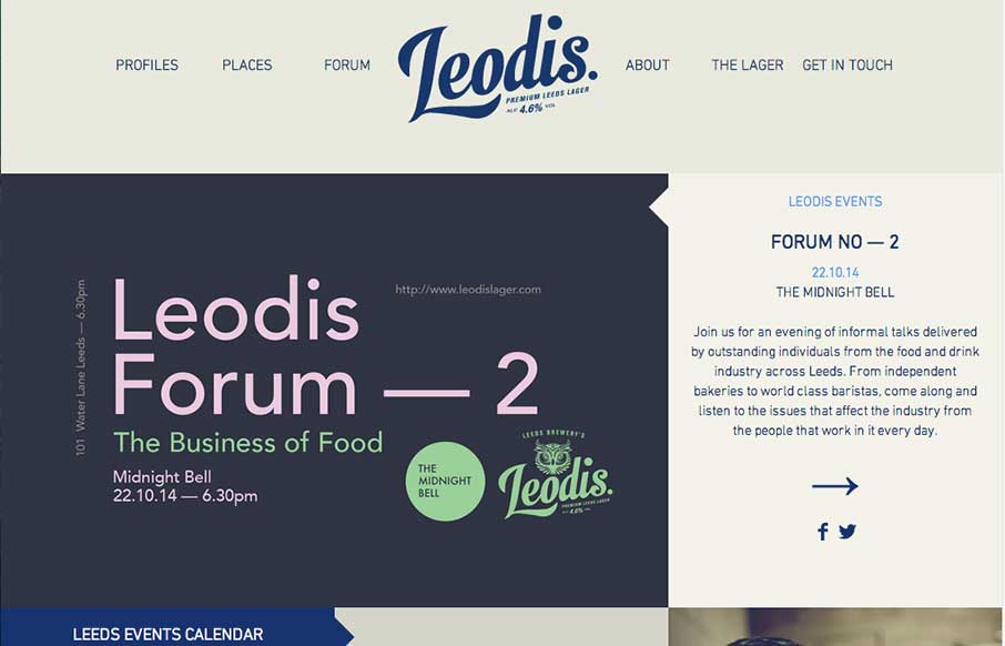
by Gene Crawford | Oct 20, 2014 | Food and Beverage, Gallery
Man I love this layout. It feels very unique to me and trust me when I say that I see a ton of website designs… Love that header interaction and the way the rest of the content is laid out. Very smart design, spend some time here guys.

by Gene Crawford | Oct 20, 2014 | Gallery
Really cool usage of transparency across sections of the layout here. I really dig how that header’s background fades into white then back out as you scroll back up. Smart details make this site really stand out to me. Submitted by: Marc Hinse @MadeMyDay Role:...

by Gene Crawford | Oct 17, 2014 | Gallery
Like Chris says below, it is indeed a nice responsive site. I love seeing work submitted that is for clients and not necessarily portfolio websites for designers or agencies. Good work here for sure. Submitted by: Chris R @therstyle Role: Designer & Developer...
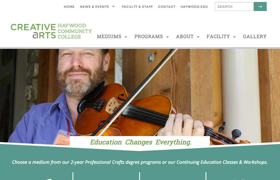
by Gene Crawford | Oct 17, 2014 | Education, Gallery
Sweet responsive site for Haywood College. I like the downward angle used to anchor the page visually, that’s a nice touch. Marisa Falcigno @helloODDS Role: Designer & Developer The website project was integral in highlighting the new identity while...