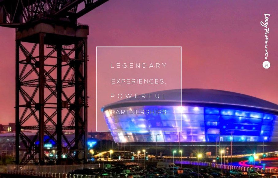
by Aaron Griswold | Jun 18, 2015 | Food and Beverage, Gallery
Like the power of the video background on the Levy Restaurants site as you start – then like the hand-drawn fonts and icons. The site looks pretty hip and with it, which seems to be the aim of the restaurants themselves. @UKLevy
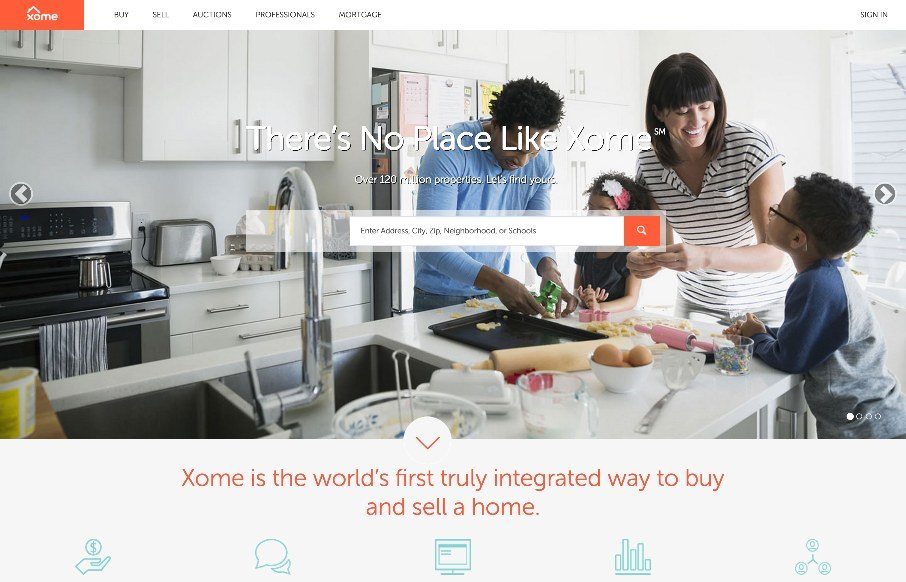
by Aaron Griswold | Jun 18, 2015 | Gallery
Pretty cool experience for a search based website. I like how the search is focused on top of the main hero image space. Keeps it front and center. There’s very little small screen width experience here but overall for desktop it’s tops. Cool form elements...
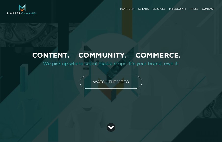
by Aaron Griswold | Jun 16, 2015 | Gallery, Music
When we were in Nashville last week for BDConf, I walked into a concert for one of Master Channel’s clients, (no, not R5 with Ross Lynch from Disney’s Austin and Ally… which my kids watch..) but country star, Kip Moore. And yes, I used the website...
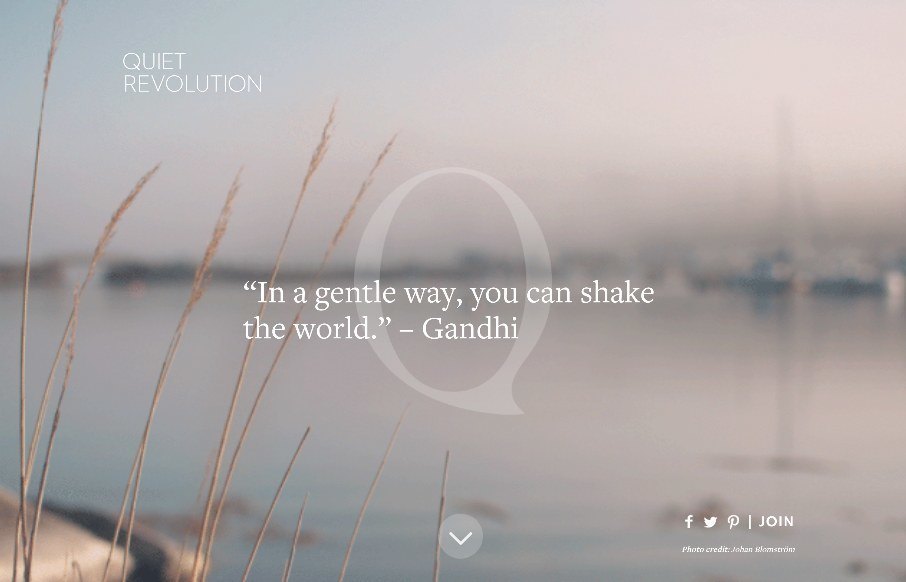
by Aaron Griswold | Jun 16, 2015 | Community / Social Networking, Gallery
As extroverted as I can be sometimes through my writing, among friends and family, and when I’m acting – I actually have an introverted nature in many social situations. That’s part of the gist of the Quite Revolution (from a philosophy standpoint),...
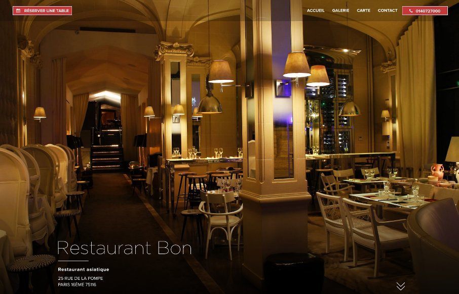
by Aaron Griswold | Jun 15, 2015 | Food and Beverage, Gallery
Elegant and simple site for Restaurant Bon out of Paris – designed by Uniiti also out of Paris. Two things to point out – on the Food Menu (Carte) page, the use of the sticky positioning of the side bar is smart. Also, like the reservation modal and how it...