by Gene Crawford | Feb 27, 2014 | Education, Gallery
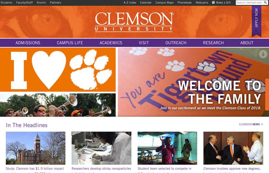
Really nice Responsive design solution for a major university website. The website is so huge (like most Univ. sites are) that i’m not going to go into any subpage stuff. The main thing I want to point out is the way the navigation is worked into the hero area...

by Maria | Feb 27, 2014 | Gallery
You see these nice responsive sites with their sticky nav and circular images and slick transitions and think, “Yeah, that’s cool, they did everything right.” I’ll be honest, you don’t typically see this much content loaded in and still...
by Giovanni DiFeterici | Feb 26, 2014 | Gallery
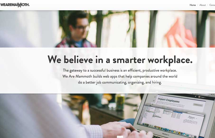
The We Are Mammoth website is a simple site that feels tight and focused in content, clear in message and definitive in style. Not much more to say. Good stuff.
by Giovanni DiFeterici | Feb 25, 2014 | Gallery
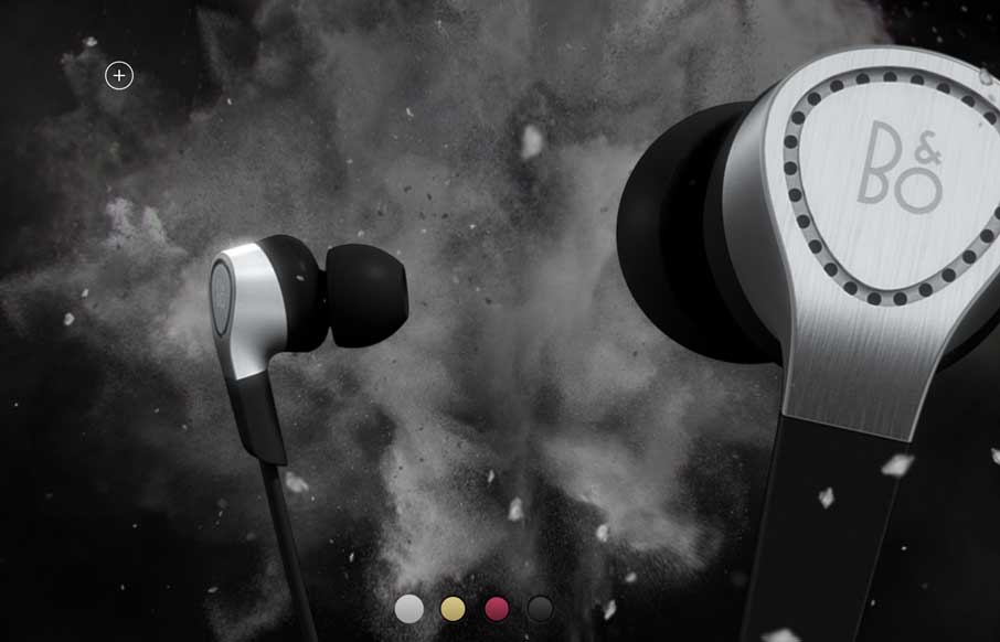
Beoplay’s H3 site site is truly beautiful. I’m often against the practice of hijacking the user’s ability to scroll, but the effect works really well on this site. Every ‘page’ is clean and minimal, but provides a very different user...
by Gene Crawford | Feb 17, 2014 | Gallery
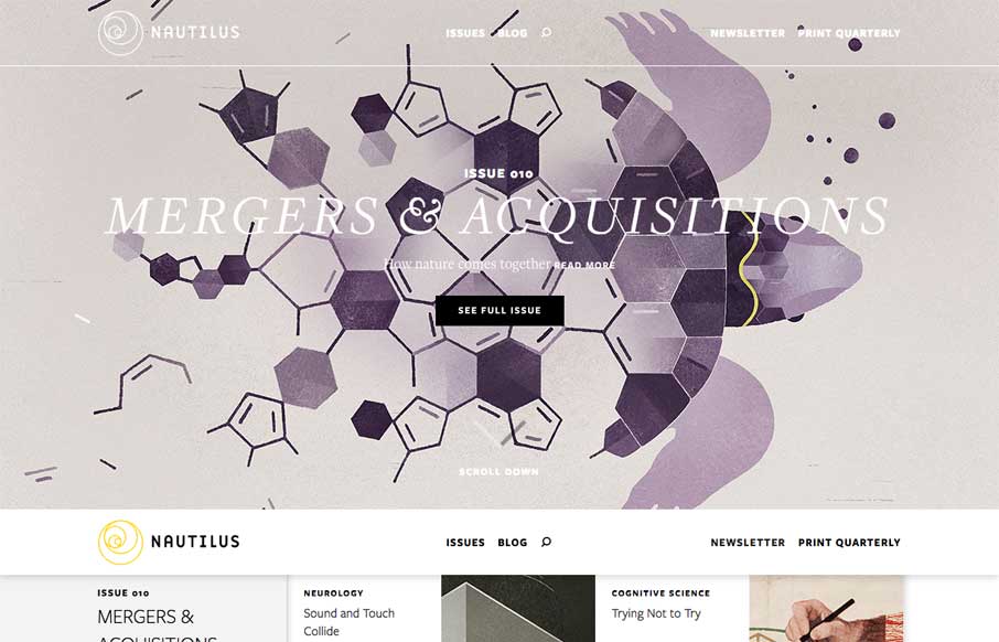
Such a great looking editorial design. Nautilus is basically a magazine that’s published both online and in print. It’s feel is very rich without being overly “interactive” – great design and solid story telling, this is awesome...