
by Gene Crawford | Sep 22, 2015 | Community / Social Networking, Gallery
Really nice and clean layout for the Atlanta Tech Village website. I like the way they are showing you people in the space, with photos and video background, etc… the home page keeps you streamlined and puts what people would want to know most up front. This...
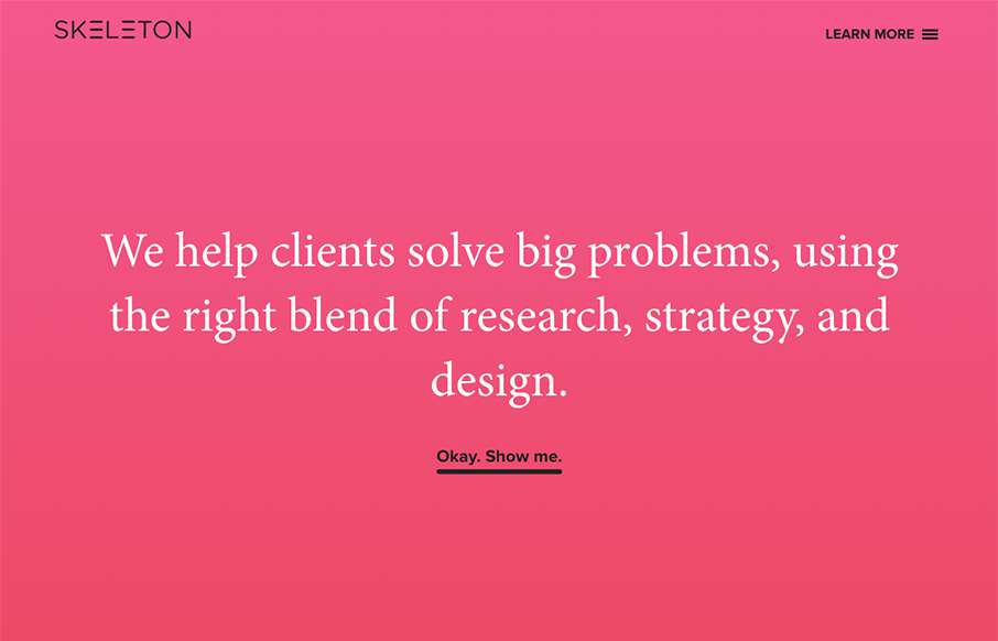
by Gene Crawford | Sep 22, 2015 | Gallery
Clear layout and hip colors and type make the Skeleton website stand out. I like the focus on the case studies first – after all it’s what you want people to check out. I dig that you get a bevy of info after you make your way past those 3 project...
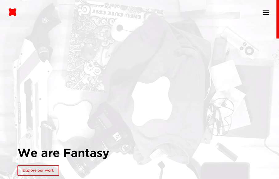
by Gene Crawford | Sep 9, 2015 | Design Firm, Gallery
Newly updated (not sure how long) design for Fantasy Interactive. It’s amazing to me to see this design, i’ve followed Fantasy for the entire time they’ve been around. You can almost track the times in design from their websites over the years. this...

by Gene Crawford | Sep 8, 2015 | Gallery
Mostly posting this for the navigation pattern. I like how when you simply mouse over the hamburger icon it loads a small set of icons for the nav. Yes, we can probably pick that apart, but i’ve never seen that before. I like it as a design pattern as a way to...
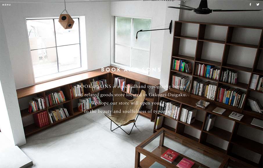
by Gene Crawford | Sep 4, 2015 | Gallery
Pretty tidy layout for Book & Sons. I dig the large imagery and the simple nature of the grid at work here. I’m not too happy with the big background images and the white text overlaid on them, sometimes the copy is impossible to read. Fixing that up would...