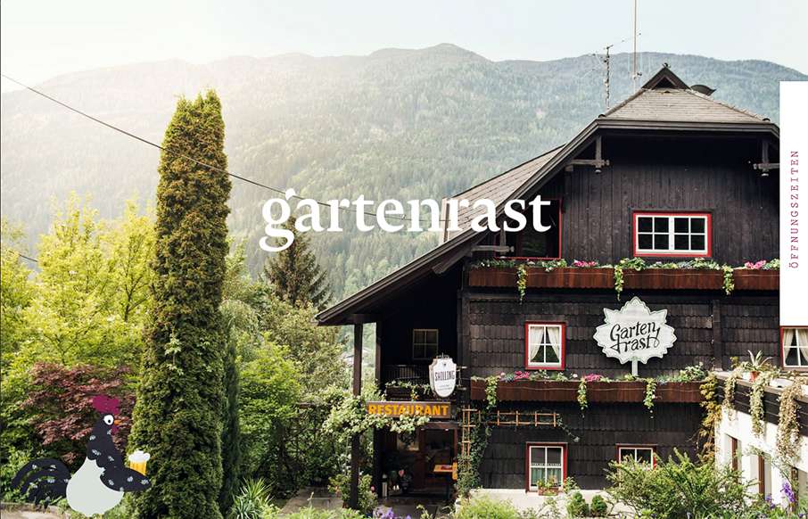
by Aaron Griswold | Oct 5, 2015 | Gallery, Travel
Clean, and a lot of gut white space. Love the hamburger / fork-knife-spoon menu – and roosters too.
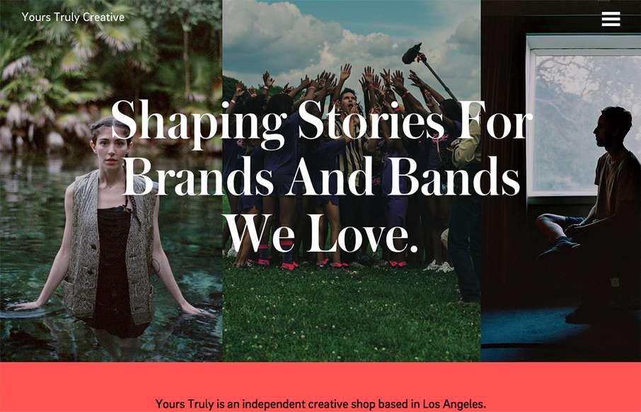
by Aaron Griswold | Oct 1, 2015 | Gallery
Really great editorial website layout. I love how the text flows between the images and the white space – and really love the rest of the text work on the other pages – it’s not totally bound to a grid.
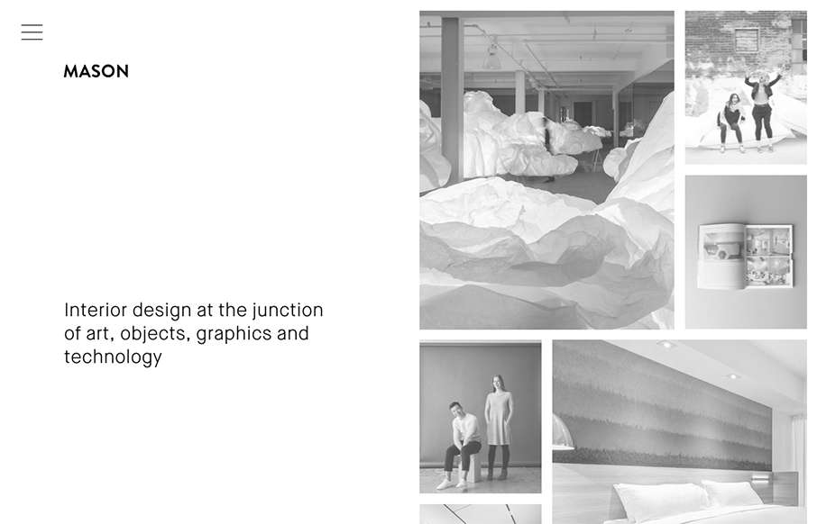
by Gene Crawford | Sep 30, 2015 | Gallery
Really cool minimal approach to the interior design studio Mason’s website. I dig that you basically only check out some images then there’s the hamburger menu, because they take you to some good sample pages of the company’s work. Simple flow of...
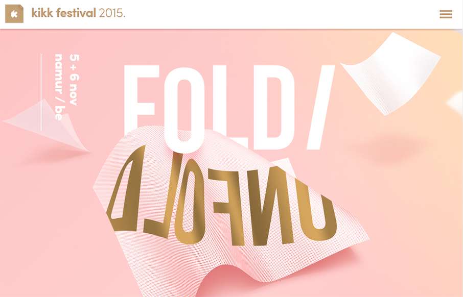
by Gene Crawford | Sep 30, 2015 | Gallery
We’ve created our fair share of event websites here at UMS, and this is one that I instantly fell in love with. I love all the interactions and detail work. It’s chock full of fun discoveries as a visitor as I move around the site, play around with it and...

by Aaron Griswold | Sep 29, 2015 | Gallery
Good, clean site from Spendee – a product page for a finance app. Good movement on the on-scroll / scroll-jacking actions – and especially like the hamburger menu that opens up simple horizontal nav on the header – it’s actually different than...