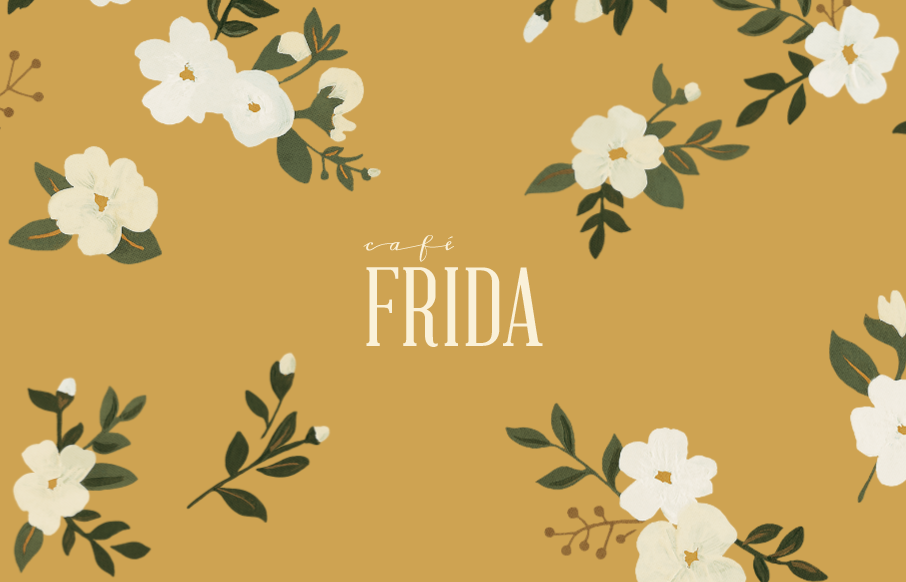
by Gene Crawford | Jul 21, 2016 | Food and Beverage, Gallery
The first thing that hits you is the interaction with the hero area. Flowing the leaves back out of the way draws you in quickly and beautifully. Then as you scroll down you see the clever image use and the way the drop out’s are used is quite nice. Really...
by Gene Crawford | Jul 21, 2016 | Gallery
I can really appreciate the simple approach to this site design. Just big bold areas of content and imagery. I love the way the interaction on the main nav works. Graying out the nav items that you’re not mousing on. Good thinking there on the UI.

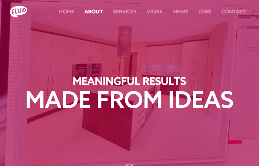
by Gene Crawford | Jul 20, 2016 | Gallery, Marketing Company
There is an awful lot going on with this site design for GO Digital. They handle a ton of content and links pretty well visually. I dig some of the interactions and that classic drop down nav just works for all the content. Solid IA under the hood it looks like.
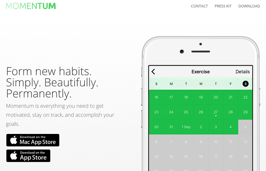
by Gene Crawford | Jul 20, 2016 | Gallery
Really beautiful and simple site for a really beautiful and simple idea. I dig this idea and I dig the design approach to the website. Show’s you how the app looks and works in context in a website layout that’s easy to scroll and take in. Good work.
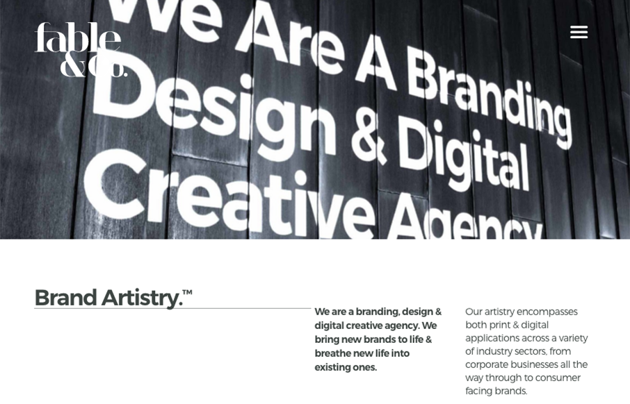
by Gene Crawford | Jul 20, 2016 | Design Firm, Gallery
The first thing I see when I check this site out is the use of typography within the imagery. Very cool. I also love the use of color being minimal and only on instances where work is being shown off. Good stuff, subtle design. Bravo.