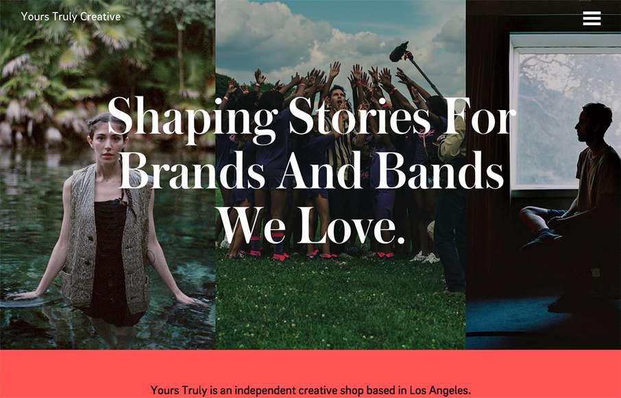
by Aaron Griswold | Oct 1, 2015 | Gallery
Really great editorial website layout. I love how the text flows between the images and the white space – and really love the rest of the text work on the other pages – it’s not totally bound to a grid.
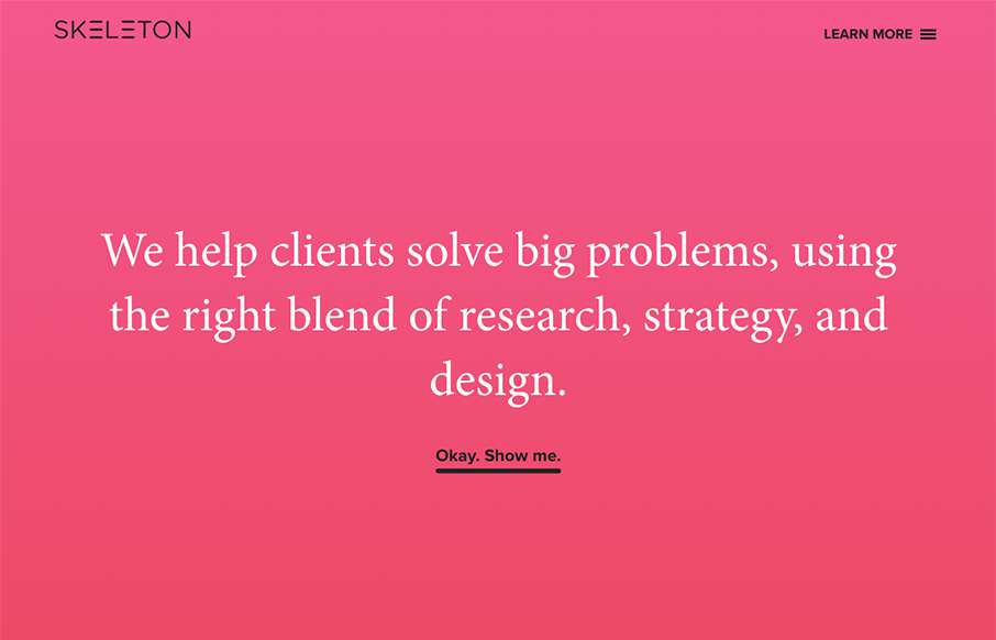
by Gene Crawford | Sep 22, 2015 | Gallery
Clear layout and hip colors and type make the Skeleton website stand out. I like the focus on the case studies first – after all it’s what you want people to check out. I dig that you get a bevy of info after you make your way past those 3 project...
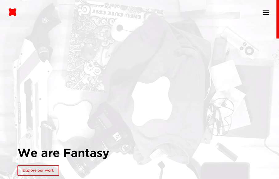
by Gene Crawford | Sep 9, 2015 | Design Firm, Gallery
Newly updated (not sure how long) design for Fantasy Interactive. It’s amazing to me to see this design, i’ve followed Fantasy for the entire time they’ve been around. You can almost track the times in design from their websites over the years. this...

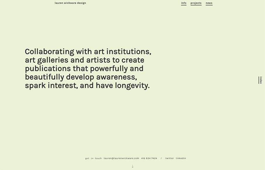
by Gene Crawford | Sep 8, 2015 | Gallery
Mostly posting this for the navigation pattern. I like how when you simply mouse over the hamburger icon it loads a small set of icons for the nav. Yes, we can probably pick that apart, but i’ve never seen that before. I like it as a design pattern as a way to...
by Gene Crawford | Sep 8, 2015 | Gallery
I love, love, love the way the scrolling works on this website. It’s smooth and very unique to experience. Very memorable experience here.