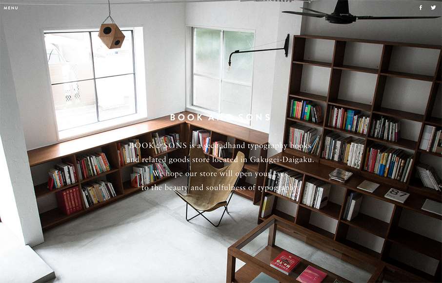
by Gene Crawford | Sep 4, 2015 | Gallery
Pretty tidy layout for Book & Sons. I dig the large imagery and the simple nature of the grid at work here. I’m not too happy with the big background images and the white text overlaid on them, sometimes the copy is impossible to read. Fixing that up would...
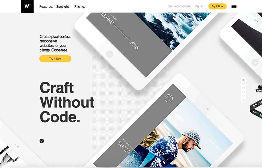
by Gene Crawford | Sep 2, 2015 | Gallery
Pretty nifty visual narrative on the home page of the webydo.com website here. I like how the photos follow you down the page through the various processes you’ll go through in editing a website with this product. The overall design is slick too. Much...

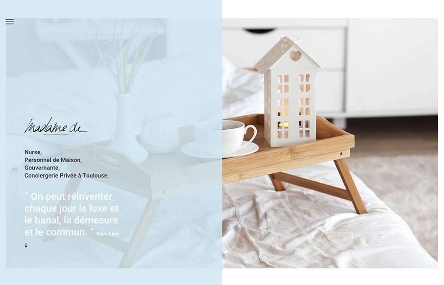
by Gene Crawford | Sep 1, 2015 | Fashion, Gallery
Superbly crafted interactions and typography for the web here. I really enjoyed scrolling through this section and reading through it. They enabled timed load-ins and animations but didn’t hamper my ability to scroll and read.
by Gene Crawford | Aug 20, 2015 | Gallery
Pretty cool look to this website, it’s soft and open feeling. I also really love the placement of the hamburger icon inside the top left corner of that darker shade/color box. It draws my eye there almost instantly.
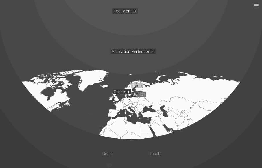
by Gene Crawford | Aug 17, 2015 | Gallery
Love this, it’s chock full of little fun interactions really selling that this guy can create what he says he can create. I also really like that it’s grayscale. @BerndHacker