by Gene Crawford | Sep 23, 2015 | Gallery, Marketing
Nice work with this heavy grid layout, lots of sections of content to get on the page. Sometimes, boy do I know, it’s hard to work with all sorts of content that a client might give you and this design just screams this to me. I really like how it’s all...

by Gene Crawford | Sep 23, 2015 | Gallery
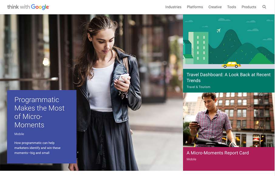
What a beautiful yet simple layout for Think with Google. I love this, material design in play as well here. Well balanced sections and plenty of space between elements make this easy to scan, read and remember.

by Gene Crawford | Sep 22, 2015 | Community / Social Networking, Gallery
Really nice and clean layout for the Atlanta Tech Village website. I like the way they are showing you people in the space, with photos and video background, etc… the home page keeps you streamlined and puts what people would want to know most up front. This...

by Gene Crawford | Sep 14, 2015 | Gallery
Some pretty crazy interactions going on here. I dig it though. The colors and type that are paired together give it a rather open yet heavy feeling. I’m a fan of the navigation design too, see, what’s the harm in just showing the nav at all times?

by Gene Crawford | Aug 20, 2015 | Gallery, Real Estate
I love the play between the symmetrical and asymmetrical elements to this layout. It’s full of little visual widgets and things to draw your eye around the page. I also really dig the menu design, having it open like it does really felt unique and memorable to...


