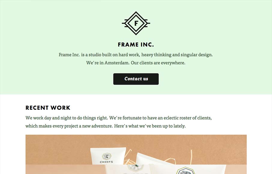
by Giovanni DiFeterici | Sep 5, 2012 | Design Firm, Gallery
I can really get behind the minimal approach to content that frameinc presents. The site isn’t cluttered up with overblown copy or quirky language and I’m not forced to wade through a huge portfolio to get a sense of what this business does. The design and...
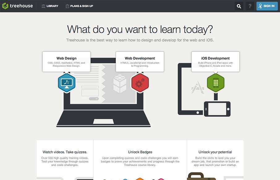
by Gene Crawford | Sep 4, 2012 | Education, Gallery
Really tight design for the Treehouse website. I love the main graphic with the interactions that make the other elements on the illustration disappear. They work really well to pull you in deeper into the chosen section. I equally like the fixed header and how...

by Maria | Aug 31, 2012 | Gallery
The emma website is very crisp. I dig that top nav and how crisp and brite it looks to me. The “get started” call to action is easy to find and understand and I like that it’s echoed on the page a couple of times. The overall layout gets more dense...
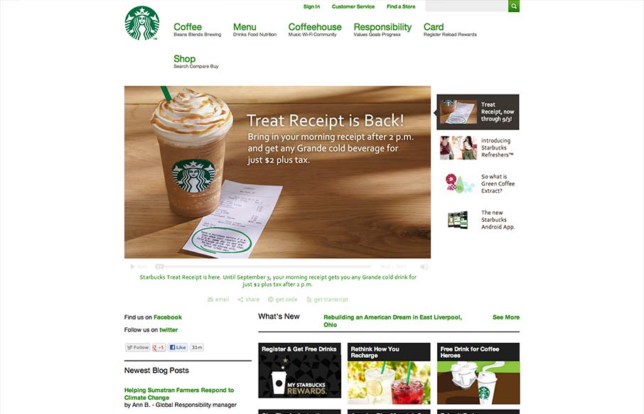
by Gene Crawford | Aug 30, 2012 | Food and Beverage, Gallery, Screencast Review
Pretty much have to include the new(ish) responsive Starbucks Coffee site in here. It has some neat sections of it’s design that are worth studying for sure. Like the different views for different screen widths on the big slideshow slider. We’ll take a...
by Gene Crawford | Aug 29, 2012 | Gallery
This site runs a little slower than we would like but unfortunately, the host provider was already chosen by the client. That aside, amazingly, this is @lindzington ‘s first ever site design. First ever! Can’t wait to work on more. The cool photos were...