by Gene Crawford | Mar 13, 2013 | Gallery, Portfolio
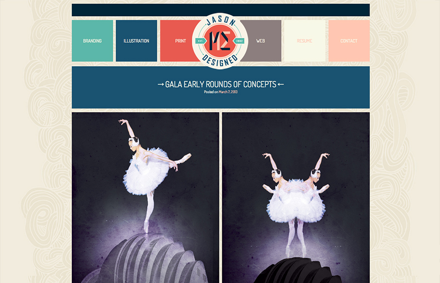
Overall pretty simple design. I just like scrolling and looking through the work, in a way it’s almost minimal in this aspect, but the color palette is pretty expansive so i’m not quite sure I can give it that moniker. It scales down to support smaller...
by Gene Crawford | Mar 12, 2013 | Gallery
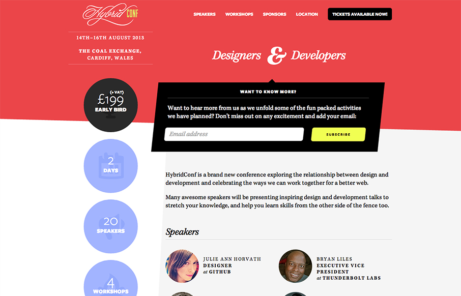
Beautiful asymmetrical design here for the Hybrid Conf website. I love it when simple design solutions wind up having such great dynamic results. The offset sidebar with the rounded profile pics just set the whole thing off right. I like the big subscribe box and the...
by Gene Crawford | Mar 12, 2013 | Gallery
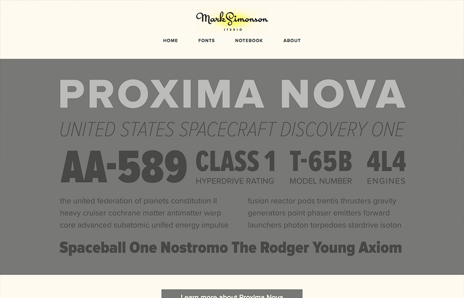
The site’s layout was planned from scratch to be fully-flexible and responsive. Users can easily browse Mark’s typefaces and read his articles from any modern device. We’re particularly fond of how the fonts page turned out. – From Parvel’s Post on the...
by Gene Crawford | Mar 11, 2013 | Education, Gallery
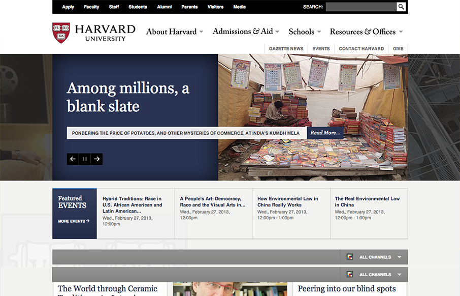
This is a well structured website. The grid is clear and easy to visually track the different sections of links. College websites are traditionally over-packed with links, this one is no exception but it’s designed in visual chunks so you can take it all in. I...
by Giovanni DiFeterici | Mar 11, 2013 | Gallery
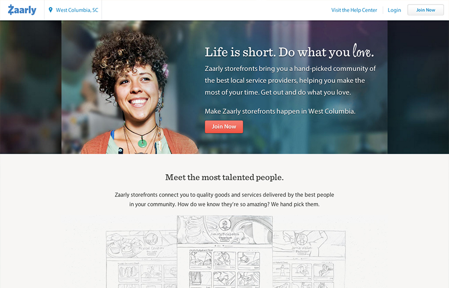
zaarly.com has a soft elegant aesthetic that beautifully balances multiple styles. The open layout and dark grey type keep the design from feeling cluttered, even on site specific pages (like zaarly.com ). It’s a ‘no fluff’ design style doesn’t...
