
by Gene Crawford | Sep 14, 2015 | Gallery
Some pretty crazy interactions going on here. I dig it though. The colors and type that are paired together give it a rather open yet heavy feeling. I’m a fan of the navigation design too, see, what’s the harm in just showing the nav at all times?
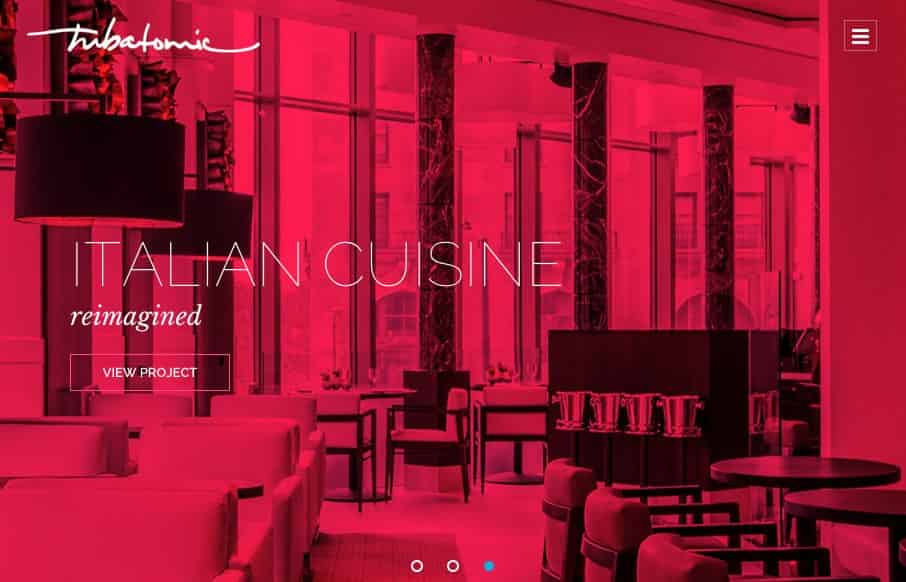
by Aaron Griswold | Aug 12, 2015 | Gallery
Pretty cool approach to use images to create the mood and vibe for the Tubatomic site. Love the coloring and gradient of the hamburger box / menu. Also like how they bring that style of coloring to their work – like the Chattanooga FC video. Good vibes....
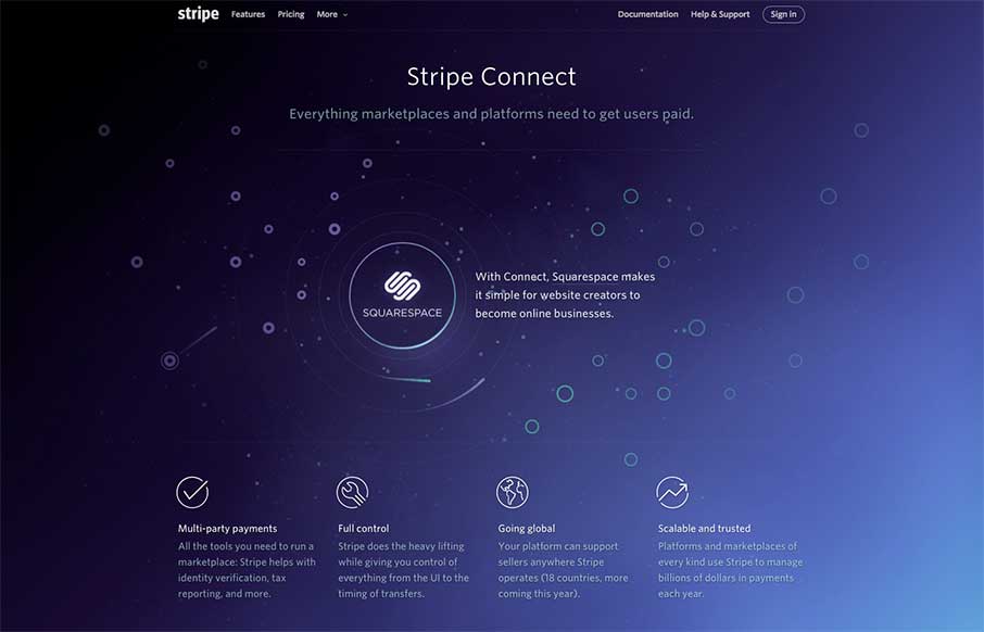
by Aaron Griswold | Mar 30, 2015 | Gallery
So… I’ve been sitting here for a couple of minutes, trying to figure out how random or not the paths of the meteors are that get pulled into the Stripe Connect orbit, and out.. and figured I should start typing before tomorrow comes… Then I used the...
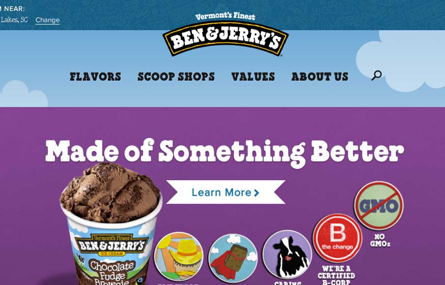
by Gene Crawford | Apr 2, 2014 | Food and Beverage, Gallery
The new Ben & Jerry’s site, done by Happy Cog is super nice. But there’s more here than just a pretty face. There is a ton of strategy behind it and you can feel it as you use the site. Mmmmm Ice Cream…. They have a pretty epic case study and a...
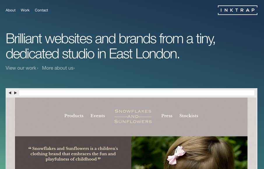
by Giovanni DiFeterici | Mar 21, 2014 | Gallery
Inktrap is a beautiful site with great details. I’m really digging the simple structure and the near perfect balance between elements.