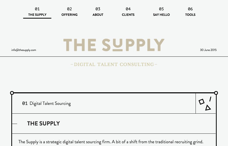
by Gene Crawford | Jul 2, 2015 | Gallery
Really, really clever layout for The Supply. It’s a very non-traditional approach to what feels like a very old school business idea of placing talent. I dig it. Submitted by: The Supply Twitter: @thesupply_feed
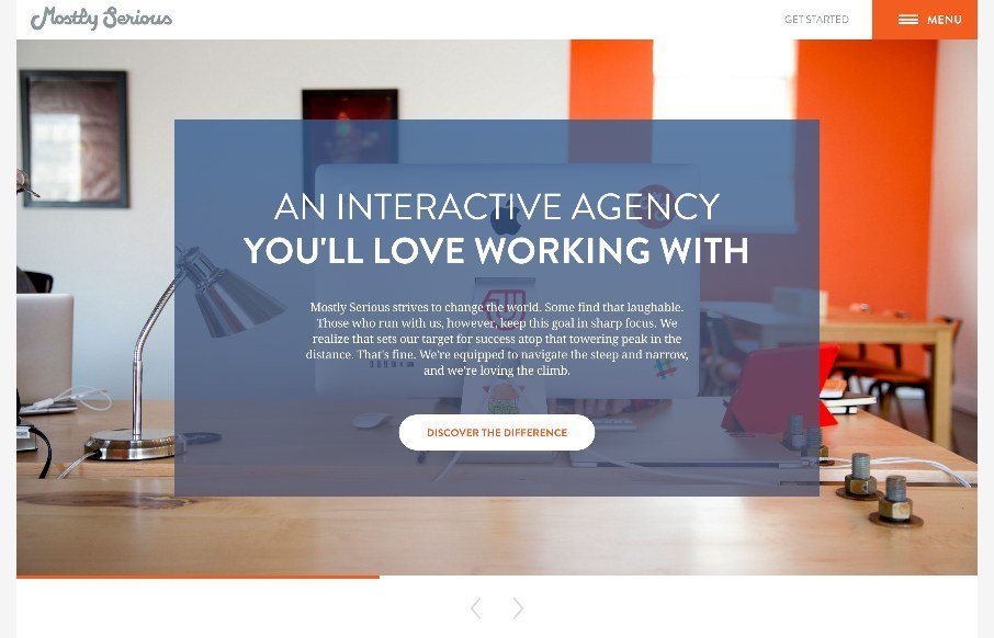
by John David Hunt | Jun 23, 2015 | Gallery
Many agency sites use large photos to bring out the human nature of their company and give us a glimpse to their habits and personalities. Others showcase their skills heavily and give no hint of who or how their work is done and practiced and whether there are humans...

by John David Hunt | Jun 11, 2015 | Gallery
What says “cool” better than a surfboard? Really besides the spectacular images of surfers and the surf community, the best part for me is the informative pages for surfboards themselves (including some with a 3d preview) and the interactive customizable...
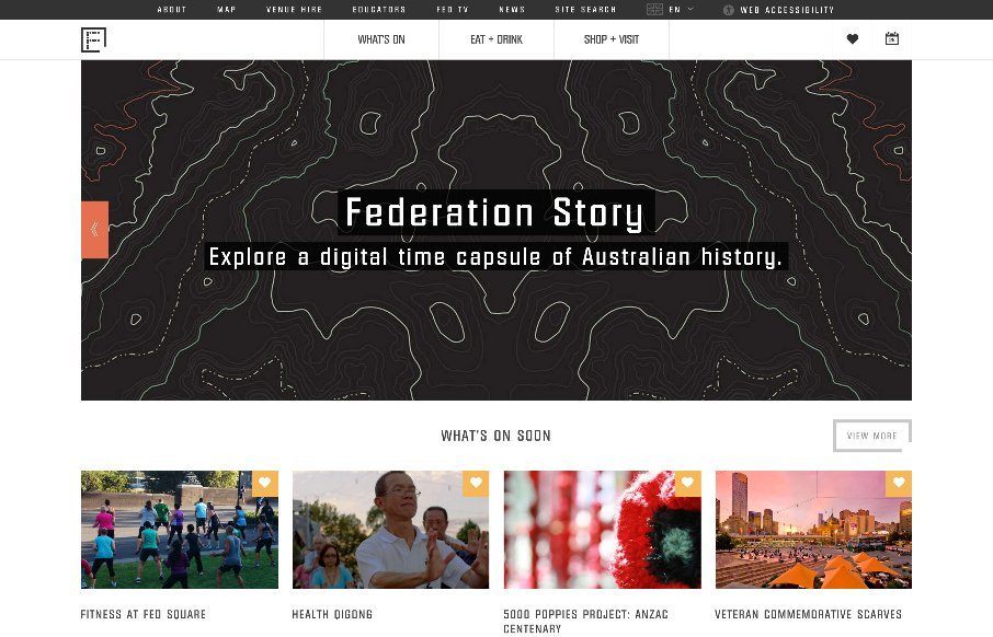
by Gene Crawford | Apr 25, 2015 | Gallery, Nonprofit
I like the blocky-ness to this layout. Though at first it comes off as little cluttery looking, I find myself liking the way the navigation is done. The small black line with standard nav items and then the larger more central nav items under that to stand out more is...
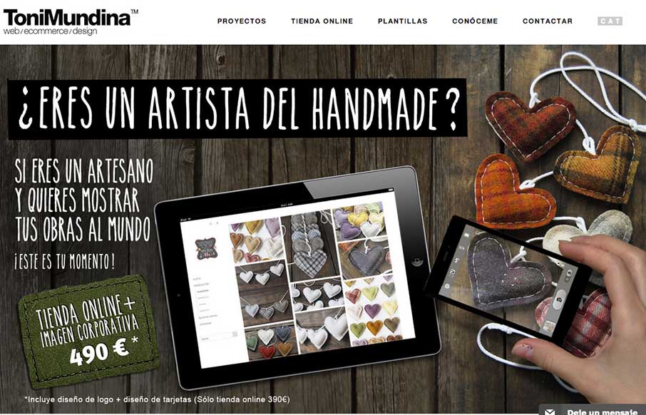
by Gene Crawford | Sep 26, 2014 | Gallery, Portfolio
It’s a standard clean style layout that has good responsive adaptations applied to the design. What I like most is the work put into the imagery, it takes time to get stuff like that to show off in a way that’s compelling. Submitted by: Toni Mundina Role:...