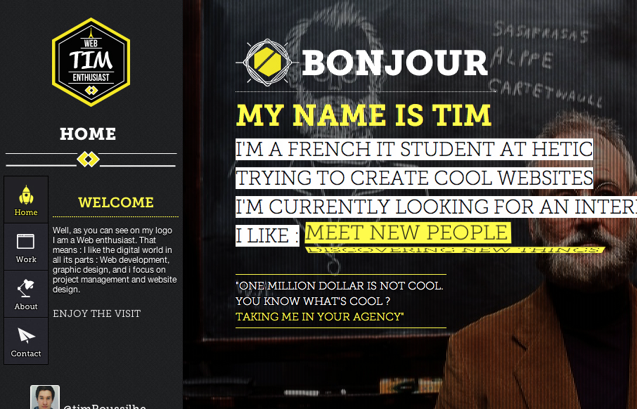
by Maria | Jun 8, 2012 | Gallery
Fantastic innovation on display here; Timothee has really gone to town creating this inviting and rewarding website. For such a small website content-wise there is a wealth of inviting features, such as a strong and fun navigation system, an unconventional colour...
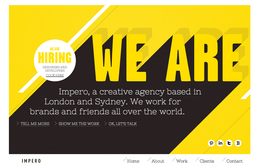
by Gene Crawford | Jun 7, 2012 | Gallery
Submitted by: Michael Scantlebury @weareimpero Role: Designer Wonderful interaction overall on this website. The horizontal scrolling elements keep it super interesting – after all it’s the same basic two types of animations but it just keeps looking fresh...
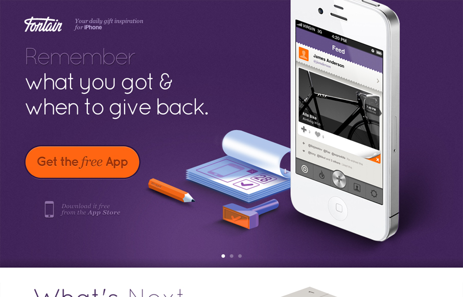
by Gene Crawford | Jun 6, 2012 | Gallery
I love how all the items/things used on the page are rendered, even the iPhone. It creates a very unique vibe. I love the colors and the dark first half and light second half, it creates a nice dichotomy for the site design. I also dig the way the slideshow is used,...
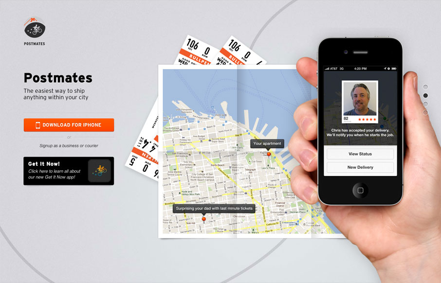
by Gene Crawford | Jun 5, 2012 | Gallery
Nice single page website for an iPhone app. I like how all they do is just show off the app and focus on telling the story of what the app does. Putting you in a scenario you can understand quickly with just a background image of a map and a sentence “sending...
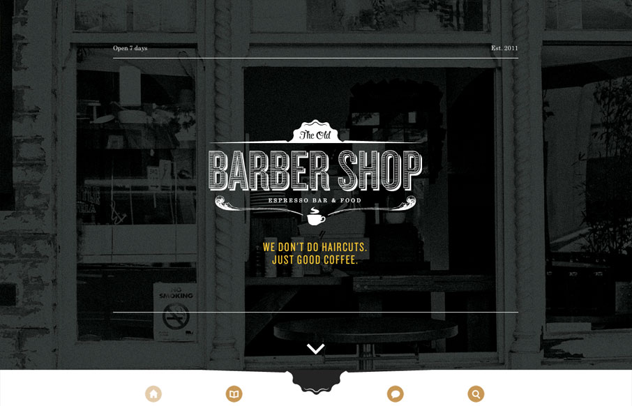
by Giovanni DiFeterici | Jun 5, 2012 | Food and Beverage, Gallery
Gene must be in love with full screen imagery and minimalism because oldbarbershop.com.au is another great example of both. The design is so simply structured that, even though its responsive, one break point suffices to accomodate all devices. I think thats...