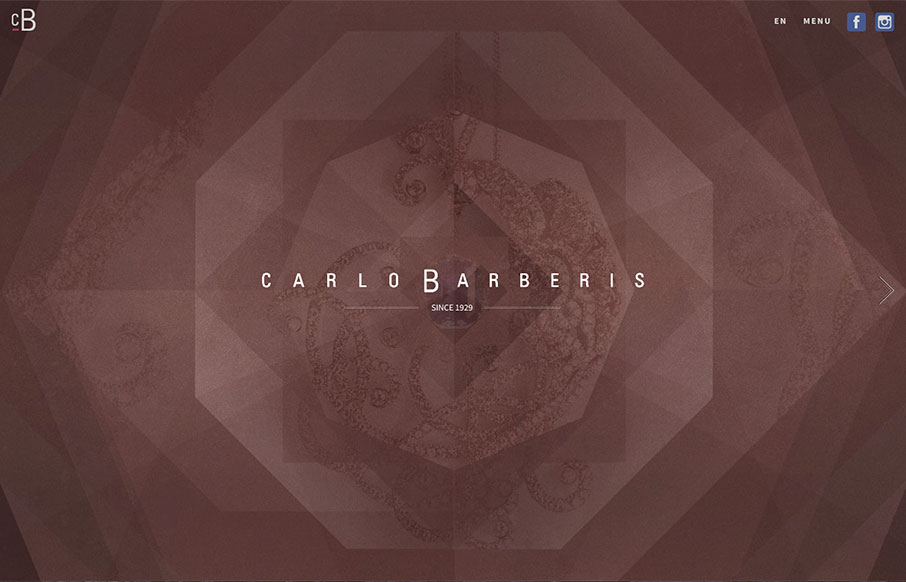
by Aaron Griswold | Feb 15, 2016 | Fashion, Gallery
This is a great showcase site for Carlo Barberis’ jewelry collection, out of Italy. Love how the home page is just a scroll slider, but before you start, the changing of the overlaying patterns already give movement and life to the page. Also think the...

by Gene Crawford | Feb 8, 2016 | Gallery
I really like the texture used in this design, it breaks of what would otherwise feel like pretty big blank spaces of flat design. I also like the illustrations a good deal.

by Gene Crawford | Feb 4, 2016 | Gallery, Marketing
Overall good design and some strong graphics make up this website. Some pretty cool load in animations as you make your way down the page. I like the way the main nav situates itself as you scroll past the hero area/image too.

by Gene Crawford | Feb 3, 2016 | Gallery
We’ve seen this hero/image area pattern before, but I like the animation used in this one, it stands out to me. I also really dig the tight illustration work used down the page here. It’s also a single page layout which I like much for this application....

by Aaron Griswold | Jan 21, 2016 | Gallery
Well – we already love the design of the Uber app – so it goes to say that their website is just as well designed. Love the sleekness of the whole site – and UX-wise, very easy to get around and get what you need.