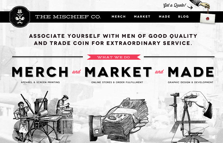
by Gene Crawford | Apr 4, 2012 | Gallery
The Mischief Co’s visual branding is quite fun. It’s somewhere between olde school and future classy (heh, I just made that up.) But I love it, it’s fun and that’s just what a site like this needs right? Technically it’s put together well...
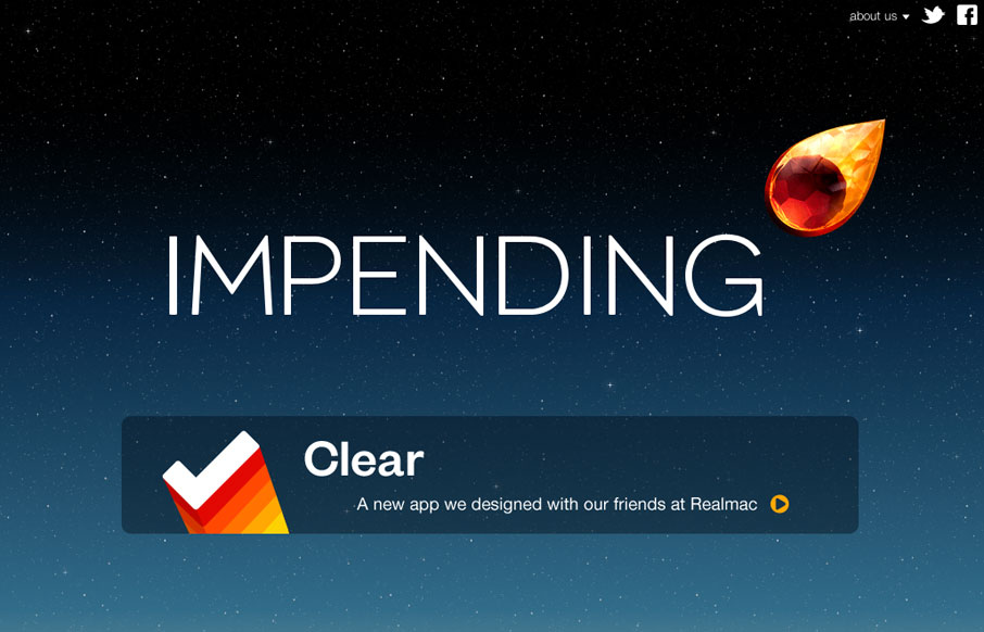
by Gene Crawford | Mar 28, 2012 | Blog, Gallery
Beautiful blog/website design by the team (partly) that made Clear. I love the crystal comet and that animation and the overall character the design gives the site. The footer is well done too and carries the visual tone all the way through.
by Maria | Mar 26, 2012 | Gallery, Marketing
Soleil Noir’s 2012 wishes is just plain fun to play with. Vertical parallax meets bright happy colors, simple messaging, and some animations to add another slight layer of wow. The nav on the side is neat. Choosing a colored dot is like picking an easter egg not...
by Gene Crawford | Mar 20, 2012 | Gallery
Submitted by: Menelaos Dimitropoulos Role: Designer & Developer Good bold typography, I like the solid feel to the whole thing. From the fixed navigation to the red/textured background it’s a nice feel to this website. I particularly like the graphs for...
by Gene Crawford | Mar 14, 2012 | Gallery
Beautiful site for this iPhone app. The fixed nav with the animated download button and large iPhone examples is well done. I like how it breaks down into a more grid like view with such nice details regarding line and typography.