
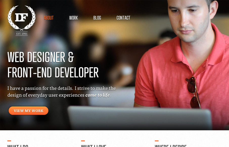
by Gene Crawford | Jul 23, 2012 | Design Firm, Gallery
Really love the parallaxy effect with the background images and the main text/copy on the home page it makes a nice stark difference between the home and sub pages. THe use of different colors for each sub page is nice overall design decision too. The website feels...
by Gene Crawford | Jul 23, 2012 | Gallery
Very thorough design. Overall the layout is engaging and crisp then the detail work is top-notch. From the interactions on the navigation and logo, the way the main navigation bar fixes itself in place as you scroll down and fades in and out. I also really like how...
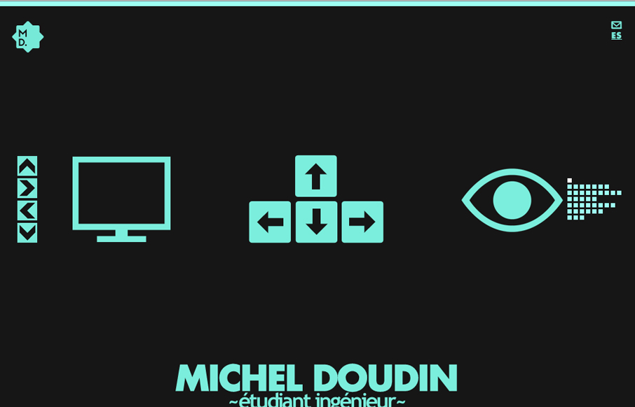
by Gene Crawford | Jul 19, 2012 | Gallery
Pretty crazy interaction here, I like the mix of arrow keys and the little navigation matrix to the right as well as the up and down arrow buttons. Covers all the bases to make it easy to understand what to do. Then the movement is so crazy and neat to watch as the...
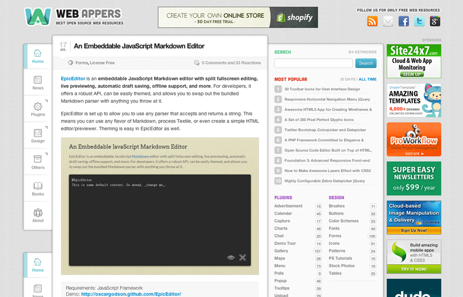
by Gene Crawford | Jul 18, 2012 | Gallery
Aside from being a top-notch resource for web development stuff the design of webappers.com is well done. It’s a nice study to compare how the different screen size designs are treated here vs. how Smashing Magazine has handled theirs. They’ve had to...
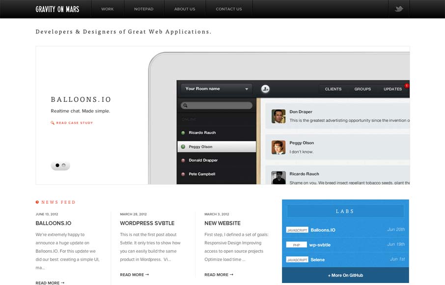
by Gene Crawford | Jul 18, 2012 | Gallery
Sharp looking minimal(ish) site design. I really like the cropping of the main image slideshow a lot. It gives a good sense of the apps and shows them in context on the iPad but it’s not overpoweringly large. The delicate lines and typography are matched up...