
by Gene Crawford | Mar 3, 2014 | Gallery
Really simple minimal approach done well. I like the logo, then to see it used again on top of the guy’s self-portrait illustration. Nice simple layout that let’s me see the work really fast while looking engaging at the same time.
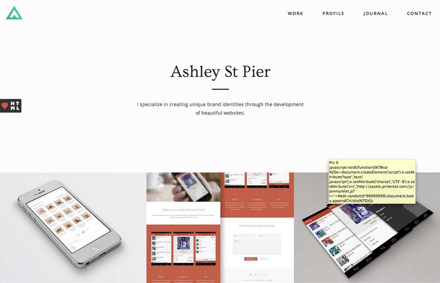
by Giovanni DiFeterici | Mar 3, 2014 | Gallery, Portfolio
Ashleystpier.com is big and beautiful. This kid is drinking the minimal Kool-Aid and it is working. Very nice portfolio site with minimal detailing and superb balance.
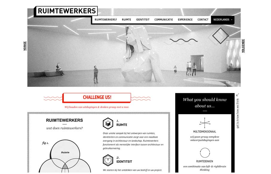
by Gene Crawford | Feb 28, 2014 | Design Firm, Gallery
I like the stark black and white box design of this website. Very simple and clean yet it almost feels gritty due to the way the boxes are used. That fixed nav section is pretty slick. I like how it just folds down to “nav” for mobile screen widths...
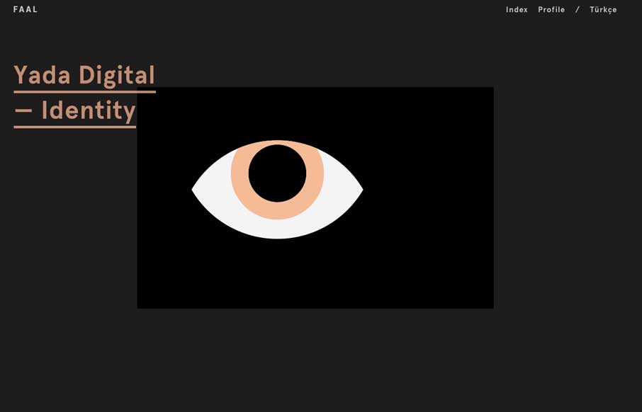
by Gene Crawford | Feb 28, 2014 | Gallery, Portfolio
Very nice portfolio site. I really dig the dark design and the simple way the title of the work is presented overly large like that. Very cool.
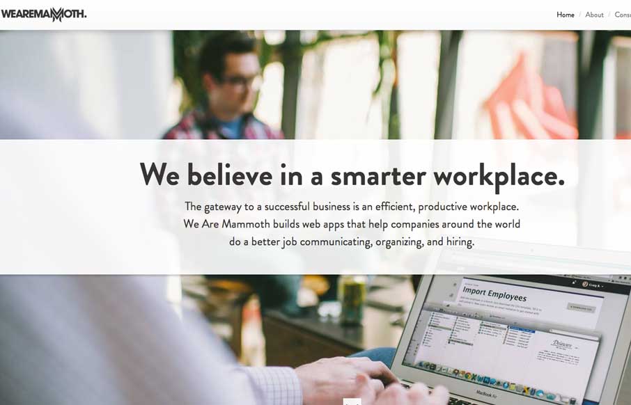
by Giovanni DiFeterici | Feb 26, 2014 | Gallery
The We Are Mammoth website is a simple site that feels tight and focused in content, clear in message and definitive in style. Not much more to say. Good stuff.