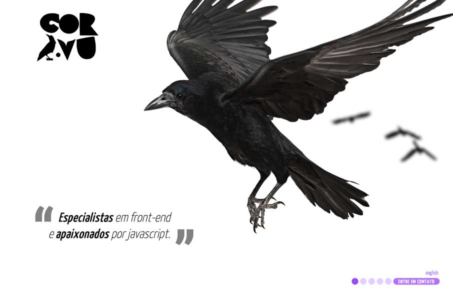
by Gene Crawford | Apr 25, 2014 | Gallery
Probably pushing the limits with this site, but I like the way they’ve utilized the imagery and loaded it up with some animation. Maybe not the best functional use, but it is fun.
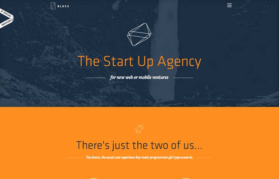
by Gene Crawford | Apr 24, 2014 | Gallery, Marketing Company
Cleverly designed illustrations/animations as you make your way down the page. I like the little detail in how the main nav works with the hamburger icon vs. how the nav items load.
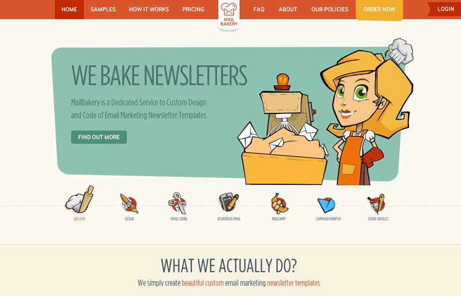
by Gene Crawford | Apr 23, 2014 | Gallery, Marketing Company
Really nice illustration work. It truly keeps me wanting to dig around more through the site’s content. I also like the little interaction animation stuff like when you resize the browser window and the main nav bar’s movement when you start...
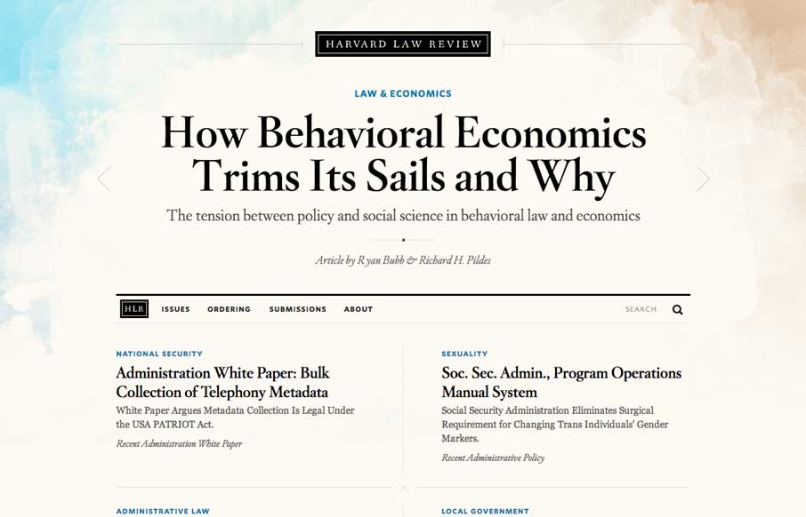
by Maria | Apr 22, 2014 | Gallery
I wasn’t expecting to see something as remotely beautiful as the home page of the new Harvard Law Review site. It’s rich yet lean, and really pushes the limits of typography successfully. The background graphic elements frame the page nicely. It’s curious that...

by Aaron Griswold | Apr 22, 2014 | Gallery
When I first looked at the site, I thought, hmm.. that’s a little too simple – one picture, no scrolling.. what gives. Then I clicked on the navigation and realized it’s a different spin on the single page website that is real trendy lately. Instead...