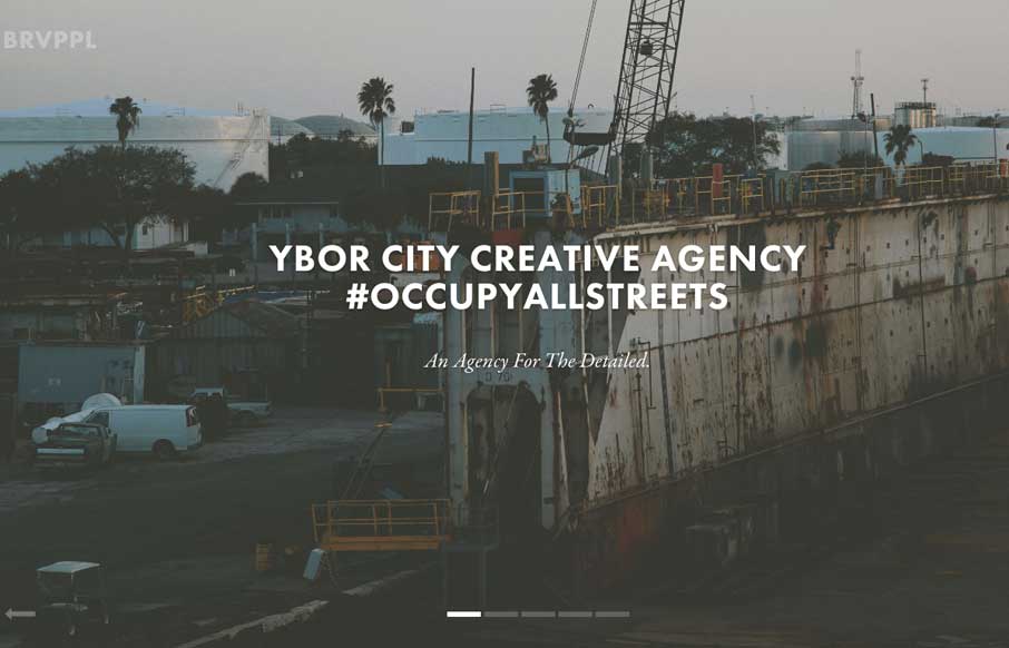
by Gene Crawford | Mar 12, 2014 | Gallery
Nice slick feel to the design. I like the soft almost washed out colors, almost black and white feel to the design. Things move well and the rhythm is good as you make your way down the page. I also really dig the plan a project form.
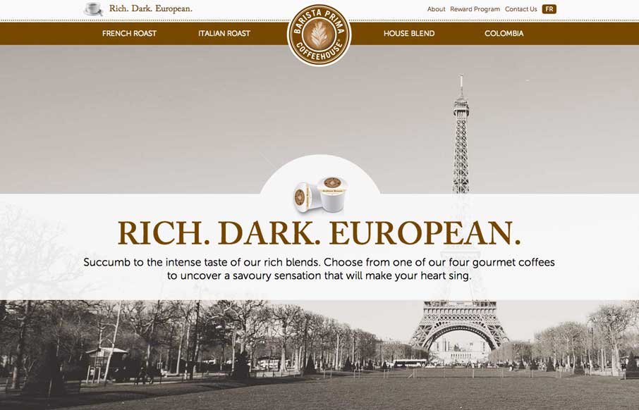
by Aaron Griswold | Mar 11, 2014 | Food and Beverage, Gallery
So… as soon as I saw this site, I fired up the Keurig. The black, white, gray and coffee brown immediately put me in a mood to enjoy coffee. The entire site is centered around the brand’s tagline: “Rich. Dark. European.” The background images,...
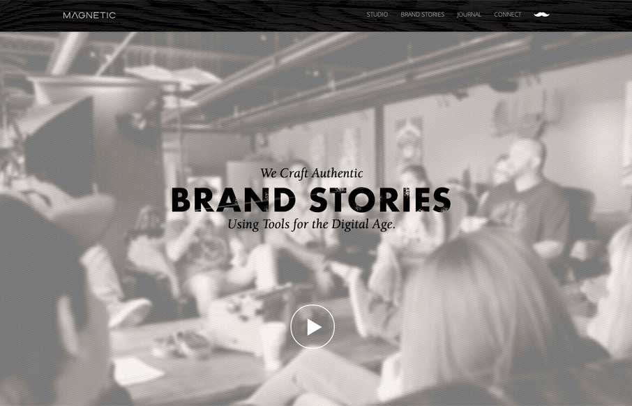
by Gene Crawford | Mar 10, 2014 | Design Firm, Gallery
Really cool looking mix of tight straight edges and hand made type treatments, mixed with the sepia colored imagery. This site has a nice hand made feel but also very high end. The slight movement of the images behind the type overlays add that extra little dimension...
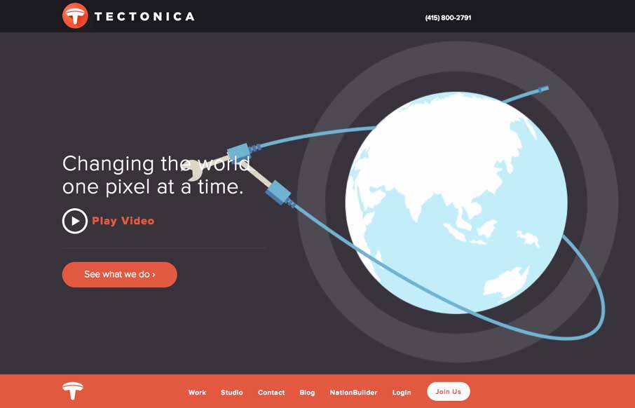
by Gene Crawford | Mar 10, 2014 | Gallery
Engaging illustrative website. There’s also plenty of interaction stuff happening on the home page to keep you interested. The thing I like most is that it’s not intrusive at all. You can engage with it by continuing to scroll or not. The look and feel of...

by Giovanni DiFeterici | Mar 7, 2014 | Gallery, Marketing
Realtii does a great job of using animation to focus the user’s attention on key details. The colors are soft and friendly. A pleasant site with simple detailing.