by Gene Crawford | Jan 7, 2015 | Gallery, Portfolio
Nice Masonry/Isotope type responsive effect here. Actually, digging into the code looks like it is Isotope… I like the usage of it here because it just feels a little different. Especially with the way the logo overlays on top of the images like that too as you...

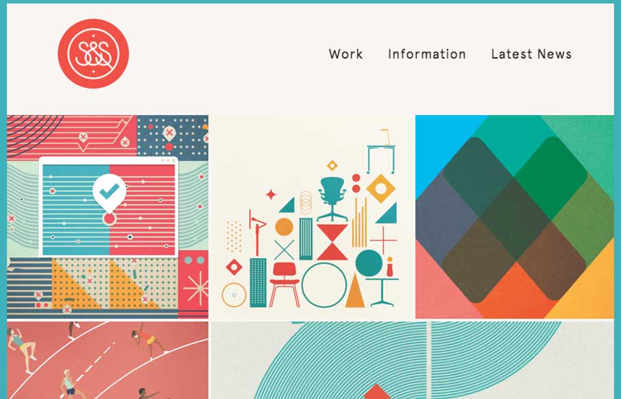
by Gene Crawford | Jan 7, 2015 | Gallery, Marketing Company
Some fairly straightforward design queues here on the Snask site. But I really really love the way the images are placed on the page. They just feel like they’re embedded in the page somehow to me. Kinda like a nice offset printed page feels. Know what I mean?...
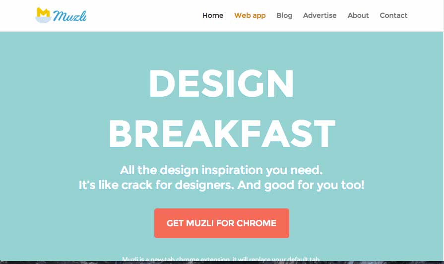
by Gene Crawford | Jan 6, 2015 | Gallery
Looks like a great resource, also looks like a nice site design for a product. I love the colors and fun little illustrations too. Good stuff here. Aaron Edit: Sorry… forgot the image… feel like Jonny from Airplane pulling the plug on the runway...

by Aaron Griswold | Jan 6, 2015 | Design Firm, Gallery
I like how Mad*Pow out of Portsmouth, NH has used their slider in a different fashion – less big image, more information. Also like how most of the coloring for the site comes from their examples of work – build a canvas, fill it up!
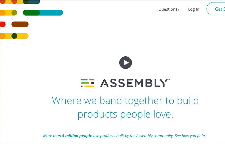
by Aaron Griswold | Dec 23, 2014 | Gallery
Really cool concept here with Assembly – looks like a crowdsourcing site directed toward different design / development products, with shared revenue for participants. Love the white space with color accents. Interesting how the sticky header comes out when you...