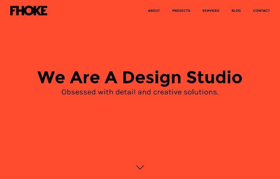
by Aaron Griswold | Apr 27, 2015 | Gallery
Reviewed Fhoke.com out of the UK less than 1 year ago….https://unmatchedstyle.com/gallery/fhoke.php – and like their new stuff. Listen, anyone who uses orange + full width + 880px headshots on the About page, is going big and bold with their design....

by Aaron Griswold | Apr 27, 2015 | Gallery
Plug and Play out of London has an interesting site. The content parts are fairly basic, and you might even think Bootstrap in those areas – but there are parts of the site that I really like. I’m really into movement on sites right now, so like the...
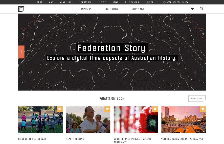
by Gene Crawford | Apr 25, 2015 | Gallery, Nonprofit
I like the blocky-ness to this layout. Though at first it comes off as little cluttery looking, I find myself liking the way the navigation is done. The small black line with standard nav items and then the larger more central nav items under that to stand out more is...
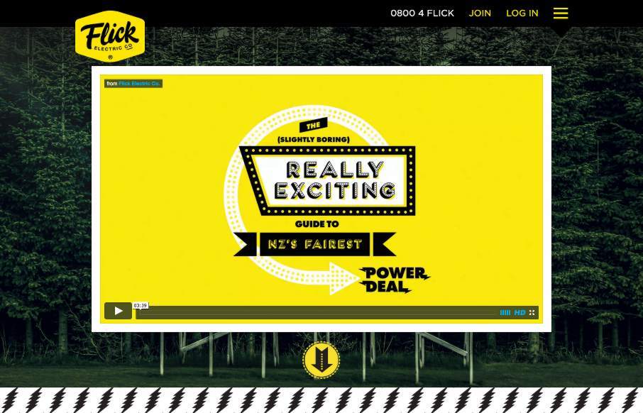
by Aaron Griswold | Apr 23, 2015 | Gallery
This Flick Electric site out of New Zealand, done by Traverse Digital in Wellington, is an example of breaking through barriers in an industry that is classically resistant to change (at least in the design sense). Flick looks to be a power / electric company that...
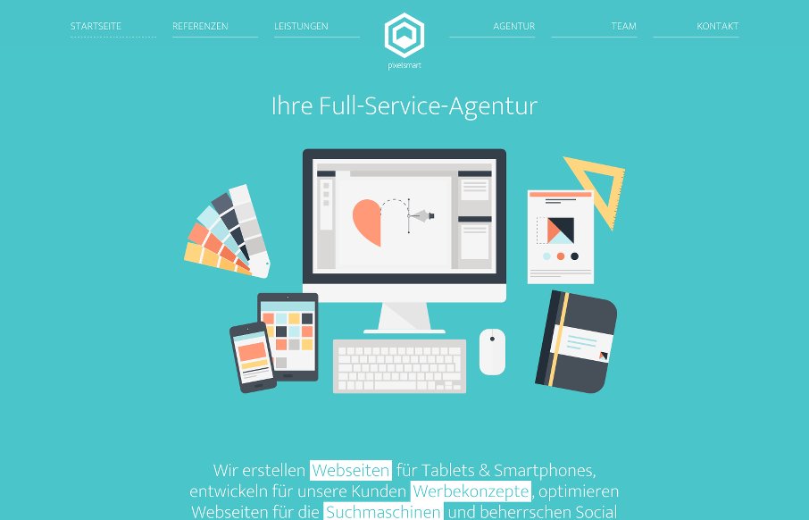
by Aaron Griswold | Apr 22, 2015 | Gallery
What I like about the pixelsmart agency site out of Germany is that they stick to a theme throughout the site – honey comb or angled view of a cube and turn it into a flat icon, you get a hexagon which shape is utilized heavily in their content design. It looks...