
by Gene Crawford | Sep 6, 2016 | Gallery
Solid grid, solid typography and a really great vertical rhythm. The Copenhagen Economics website is beautiful from top to bottom. The mobile screen view is just as solid too. Check this one out for sure.
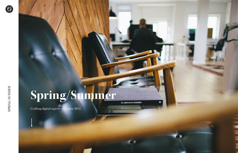
by Gene Crawford | Mar 28, 2016 | Gallery
The first thing that hits you is the photography, it pulls you in. Then there’s some superb typography everywhere. Solid rhythm implied with the layout as you scroll down the page, it almost sings to you as you take it in.
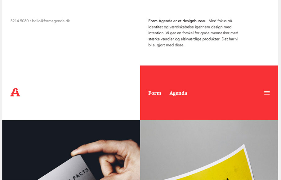
by Gene Crawford | Mar 15, 2016 | Design Firm, Gallery
Super non-traditional looking layout for the Form Agenda website. It does everything right IMHO. I like the contact info in the top left – instead of a logo. Very clever. Then the rest of the grid is very active and keeps it fresh feeling as you scroll down the...
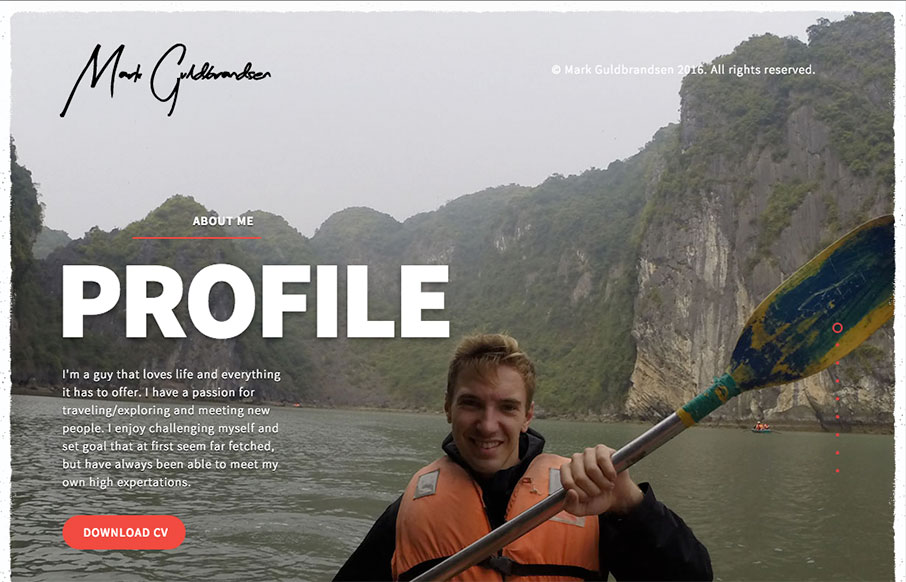
by Gene Crawford | Mar 14, 2016 | Gallery, Portfolio
Nice portfolio website. It functions almost like a power point would, with big screens you move between. In that aspect I like the simplicity of the approach. What do you guys think? Does that work for you here?
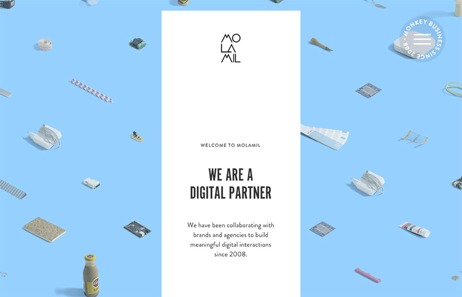
by Aaron Griswold | Dec 17, 2015 | Gallery
Fun, fun, fun. I like this site from Molamil out of Denmark – even if the wack-a-mole heads of the employees are a little creepy… Great transitions into other pages – and fun vibe all the way through! Submitted by: Joakim Norman Twitter: @molamil...