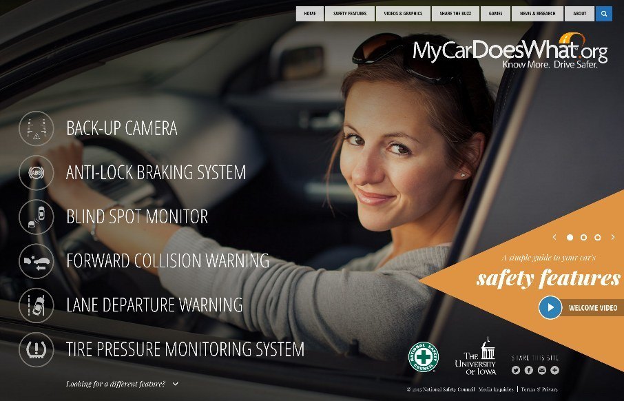
by Aaron Griswold | Jul 13, 2015 | Gallery
Pretty cool site from the National Safety Council, called My Car Does What?: “MyCarDoesWhat.org is a national campaign to help educate drivers on new vehicle safety technologies designed to help prevent crashes. These technologies range from increasing the...
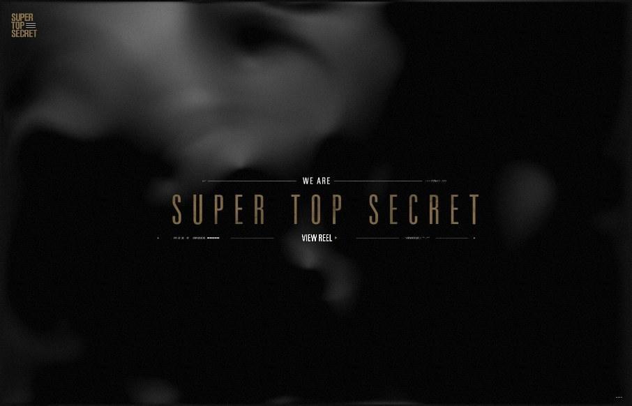
by Aaron Griswold | Jul 10, 2015 | Design Firm, Gallery
Dang. Enough said. @wearetopsecret
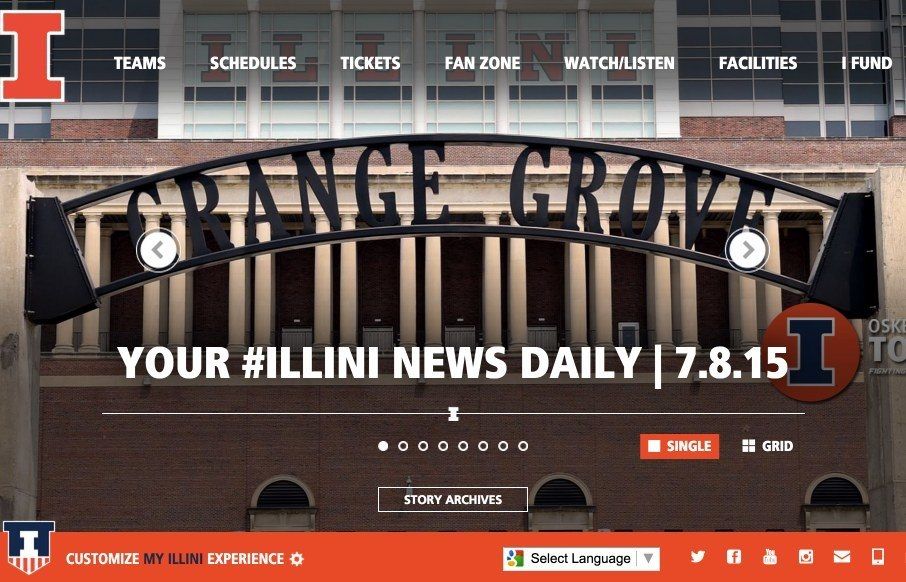
by Aaron Griswold | Jul 8, 2015 | Gallery, Sports/Recreation
Love to see sports sites being redesigned over the past couple of years – like this one for the Fighting Illini, in, well, Illini country. It’s device sensitive, and looks big and bold on both desktop and mobile. I’m not a big fan of sticky headers...
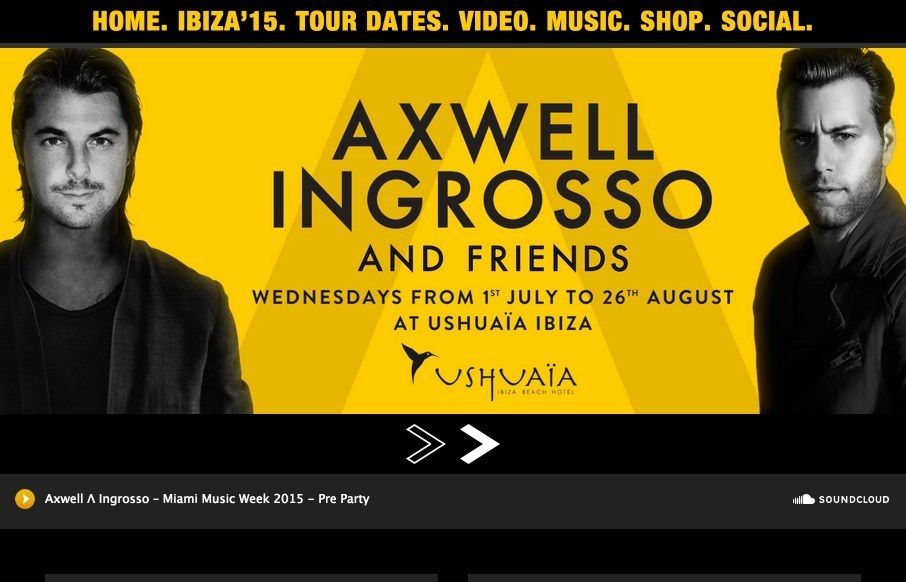
by Aaron Griswold | Jul 8, 2015 | Gallery, Music
Ok – I don’t know who Axwell and Ingrosso are (musicians out of Sweden who play every Wednesday in Ibiza) – but my girls liked their video and music when I played it for them this morning (good message btw). Their website, designed by @kaleidco, is...

by Gene Crawford | Jul 7, 2015 | Gallery
I’m not always a huge fan of super dark websites like these, but in this case there are some pretty great parts. I like the gold mixed in with the dark vibe. I like the second section, under the hero/video area a great deal. I really like how it loads in....