
by Aaron Griswold | May 7, 2014 | Gallery, Portfolio
Really, really great design for a portfolio site. I love the different pieces worked up for the slider/hero area. Brilliantly visualized and communicated stories. The rest of the site is simply wonderful and simple as well.
by Maria | May 6, 2014 | Gallery
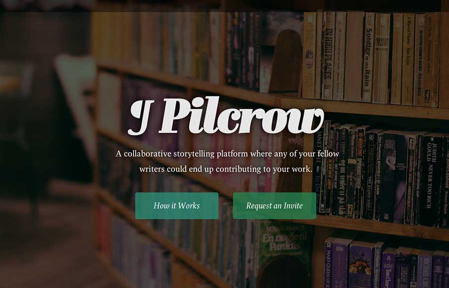
This is a simple landing page app with a few polished touches that push it beyond your typical static (read: boring) coming soon page. Dive into “How it Works” and you’re greeted with a super smooth animation. We’re talking about plain white...

by Gene Crawford | May 2, 2014 | Gallery
Man this site is stacked with cool graphics and interaction stuff. I love the color combo and how it’s put together. The “menu” link that opens up more nav options while sticking the main two out beside it is so smart. Really beautiful website.
by Gene Crawford | May 2, 2014 | Gallery, Travel
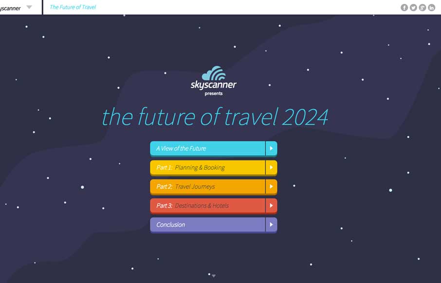
Oooh, what a nice site to check out. I luuurve the illustrations and how they’re used to tell a story. Beautiful stuff.
by Gene Crawford | May 1, 2014 | Gallery
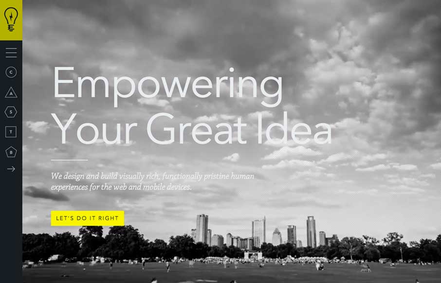
Cool vibe to this site. I like using it. The use of the “hamburger” icon to show the names of the pages/sections instead of only relying on the icons is a good idea. I love the yellow and black with the B&W imagery to boot.
