
by Gene Crawford | May 19, 2014 | Gallery, Sports/Recreation
Nice looking straight forward site. Covers all the basis and is quite loaded with content. Also it’s something totally different than a portfolio website which is always nice to compare and contrast.

by Gene Crawford | May 13, 2014 | Gallery
Pretty neat animations/interactions. I love how all the things slide into view in an almost surprising way as you scroll down. The multi use of the scroll and arrow keys is smart too. Also it’s responsive.

by Aaron Griswold | May 13, 2014 | Gallery
Pretty clever use of loading animation effects as you scroll down this site for the first time. It helps take what is a pretty hard edged and clean design and give it some life. This kind of interactive feel is what gives stuff depth sometimes – you can take it...
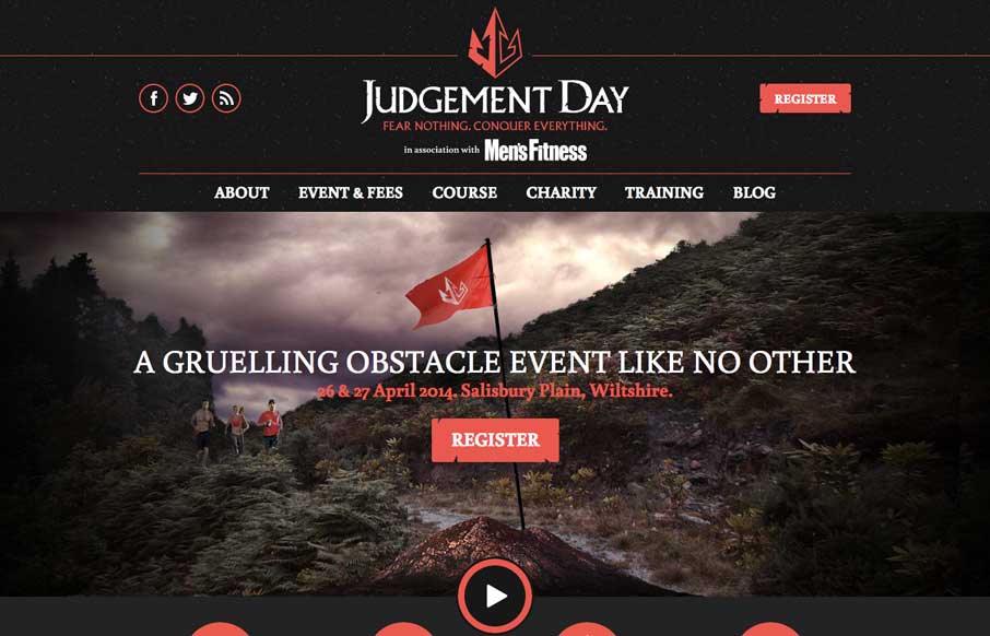
by Aaron Griswold | May 8, 2014 | Gallery, Sports/Recreation
Cool site that keeps it simple and is a straight forward layout. Proving good photography, content and solid layout work. Also this race looks fun.

by Aaron Griswold | May 8, 2014 | Gallery
Nice design that feels really different than what i’m used to seeing. The diagonal lines give it some real dynamism.
