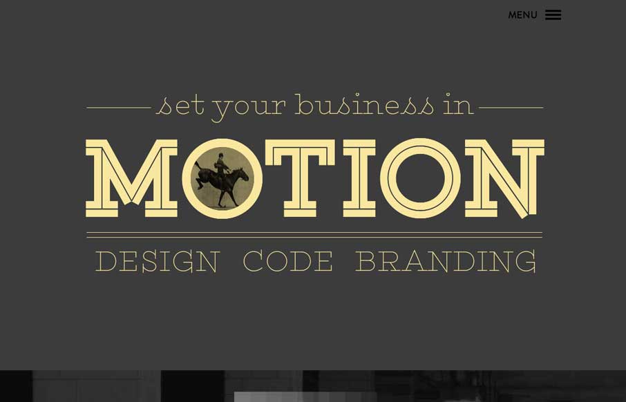
by Gene Crawford | May 30, 2014 | Gallery
Cool, almost subtle use of animations to draw your eye on the page. I like the slide out nav (not the hamburger icon use 🙂 but how they’ve used the big graphic blocks as marquee elements in the nav itself. Clever.
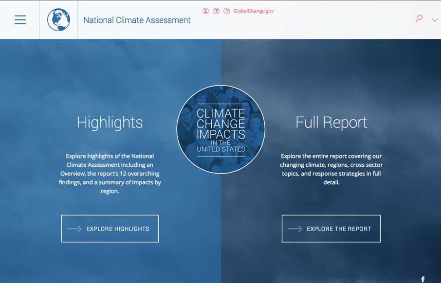
by Gene Crawford | May 23, 2014 | Gallery, Government, Nonprofit
Aside from being scared now. The National Climate Assessment website is a thing of beauty. Fully responsive and pretty dang immersive. Beautifully executed.

by Aaron Griswold | May 22, 2014 | Gallery
Wow. We were talking to a client yesterday about how they wanted to present images on their website in a way that will wow people, and make them want to read more / interact with the site. Deux’s website does that for me. I actually wanted to click on and see...
by Gene Crawford | May 21, 2014 | Blog, Gallery
What a beautifully thought out and executed experience the Code & Theory website is. I spent at least 15 minutes just clicking through and scrolling around this site.
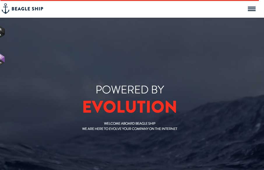
by Gene Crawford | May 20, 2014 | Gallery
Cool interactions and content blocking. I really dig the first time experience when you hit this site. The way the portfolio navigation on the home page is designed is very cool along with the loading animations of the 3 marquee sections.
