by Gene Crawford | Apr 11, 2016 | Gallery
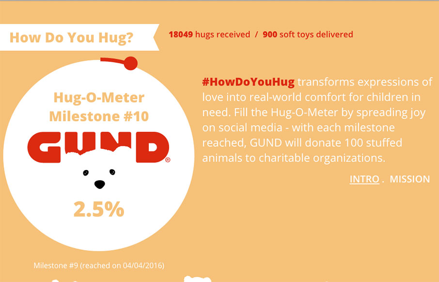
Pretty neat idea for Hugs. 🙂 I really do like the way the main three columns are setup, centered around the core content of the website. The bears are a nice central theme element too. Lovely. From the Designer: HowDoYouHug transforms expressions of love into...
by Gene Crawford | Apr 7, 2016 | Food and Beverage, Gallery
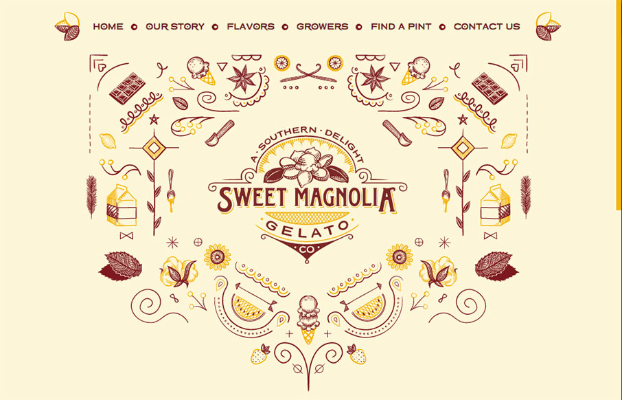
A lot of fun for this website for Sweet Magnolia gelato. The illustration is top-notch and made extra fun with the animation. The execution might leave something on the table but I don’t care. GELATO! From the Designer: Sweet Magnolia Gelato Co. makes gourmet...
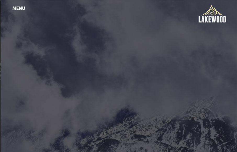
by Gene Crawford | Apr 7, 2016 | Gallery
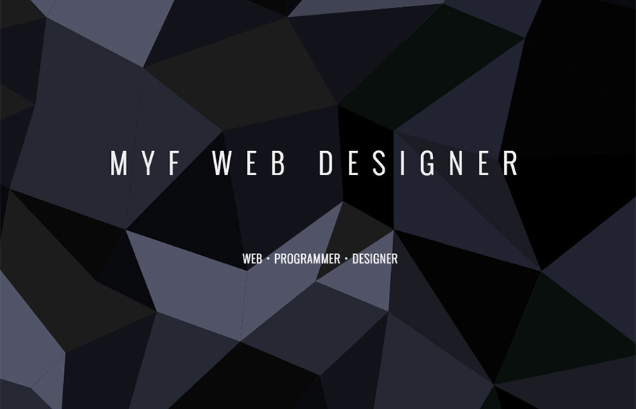
It’s sort of your standard affair in terms of “stuff” on the page, but it just feels nice. I like the dark colors and cool shapes that you start off with. Overall nice design. From the Designer: I’m Bren, a reliable, efficient and motivated web...
by Gene Crawford | Apr 7, 2016 | Gallery, Portfolio
Really cool pacing on the content blocks as you scroll down the page. Also some really clever interaction points, like the email link/icon that pulses in the corner and the side navigation that appears as you move down the page. Solid stuff there, worth a good long...
by Gene Crawford | Apr 6, 2016 | Gallery
Strong graphically. I dig the overall vibe of this website, I extra like the way the two main sections are presented in the “middle” of the home page. I am not a fan of waiting through the loading % bar thing, but I suppose that can’t be helped to a...