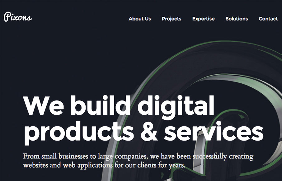
by Aaron Griswold | Apr 13, 2016 | Gallery
Good, clean site out of the Ukraine for Pixons. I like the block design and work on the Projects page especially – good balance with imagery and descriptive text. From the Designer: This is our company brand new website. We build digital products & services....

by Gene Crawford | Apr 12, 2016 | Gallery
Solid, simple 3 column based layout. Dark background is good as well. What I love most and what IMHO really sets this website off into orbit is the navigation design/interaction. I freaking LUUURRRVE this thing! A personal portfolio design is never an easy task. 5...
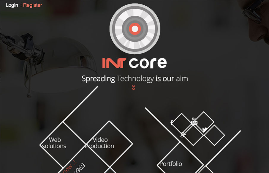
by Gene Crawford | Apr 12, 2016 | Gallery
Pretty straightforward design. It isn’t perfect but it does have several cool details that are worth reviewing. From the Designer: Intcore is one of the Egyptian leading companies in software development and media production that working hard to meet all...
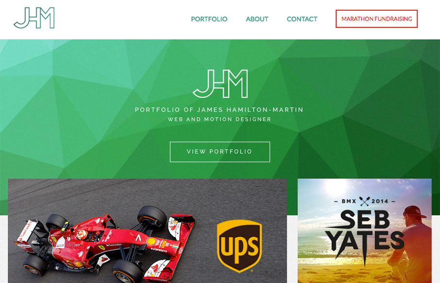
by Gene Crawford | Apr 12, 2016 | Gallery, Portfolio
Nice portfolio site for James here. I love the green background/shapes and the way the portfolio pics overlap slightly. Very clean layout and I loves it! Also, he’s running a marathon, so give the man some support! From the Designer: A responsive portfolio...

by Gene Crawford | Apr 11, 2016 | Gallery
Some pretty slammin’ loading animations in the hero area of this site. Then some here and there down the page as you scroll. Simple layout and straight forward copy make it easy to take in everything about LivX. We are a tightly-knit team of passionate people,...