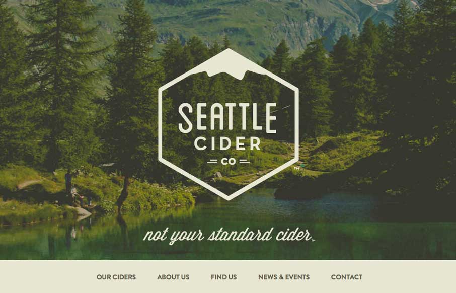
by Giovanni DiFeterici | Mar 5, 2014 | Food and Beverage, Gallery
The Seattle Cider Company website uses flat illustrations and simple interactions to control the narrative of the cider making process. The design style is hip and minimal with a few nifty tricks (like the slide-in fixed nav) and a lot of character. The narrative...
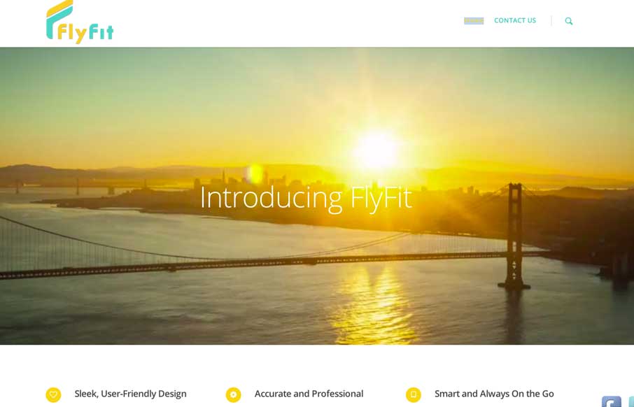
by Aaron Griswold | Mar 5, 2014 | Gallery, Marketing
This is a fast loading video based site that was made for a large screen. It has subtle parallax elements that don’t detract from the main video feature of the site. They could probably go with a cleaner social media linking system, but since it’s a new...
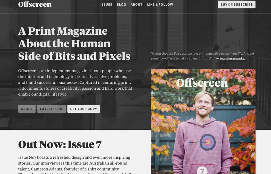
by Giovanni DiFeterici | Mar 4, 2014 | Gallery
Offscreenmag.com looks great at all screen sizes. I really enjoy the balance of the typography and soft grays. The site does a great job of balancing a lot of information with a minimal design language. Simple and elegant. We get the mag and that’s nifty too....

by Gene Crawford | Mar 3, 2014 | Gallery
Really simple minimal approach done well. I like the logo, then to see it used again on top of the guy’s self-portrait illustration. Nice simple layout that let’s me see the work really fast while looking engaging at the same time.
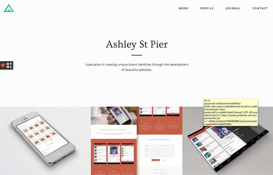
by Giovanni DiFeterici | Mar 3, 2014 | Gallery, Portfolio
Ashleystpier.com is big and beautiful. This kid is drinking the minimal Kool-Aid and it is working. Very nice portfolio site with minimal detailing and superb balance.