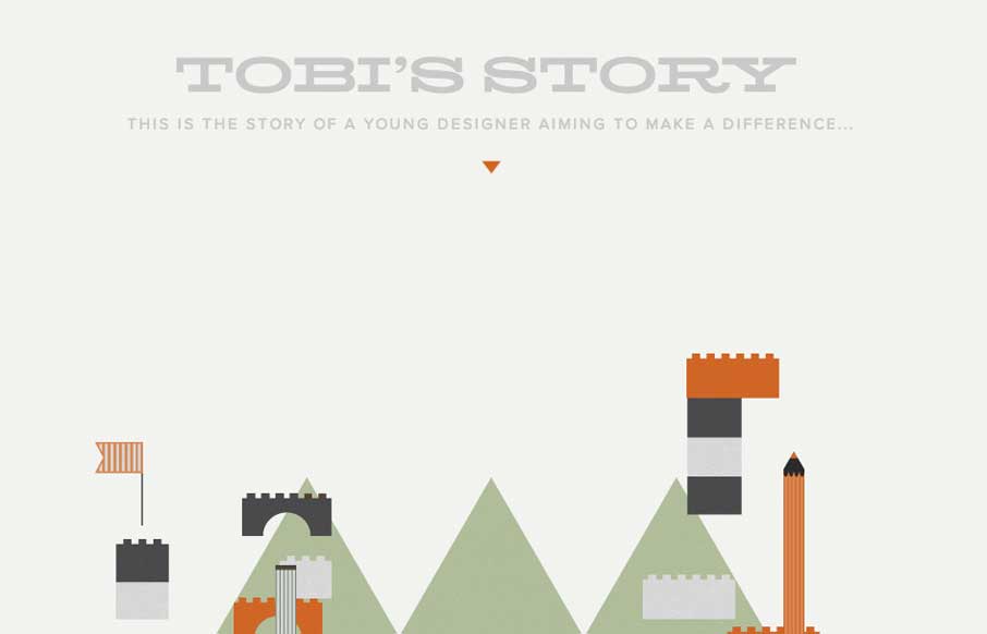
by Gene Crawford | Mar 10, 2014 | Gallery, Portfolio
The Toby’s Story site is just fun. There’s really no functional aspect to it, like a call to action or newsletter signup but you know what I don’t care. It’s cute and exists solely just to be a fun little experiment. I always love seeing that...

by Giovanni DiFeterici | Mar 7, 2014 | Gallery, Marketing
Realtii does a great job of using animation to focus the user’s attention on key details. The colors are soft and friendly. A pleasant site with simple detailing.
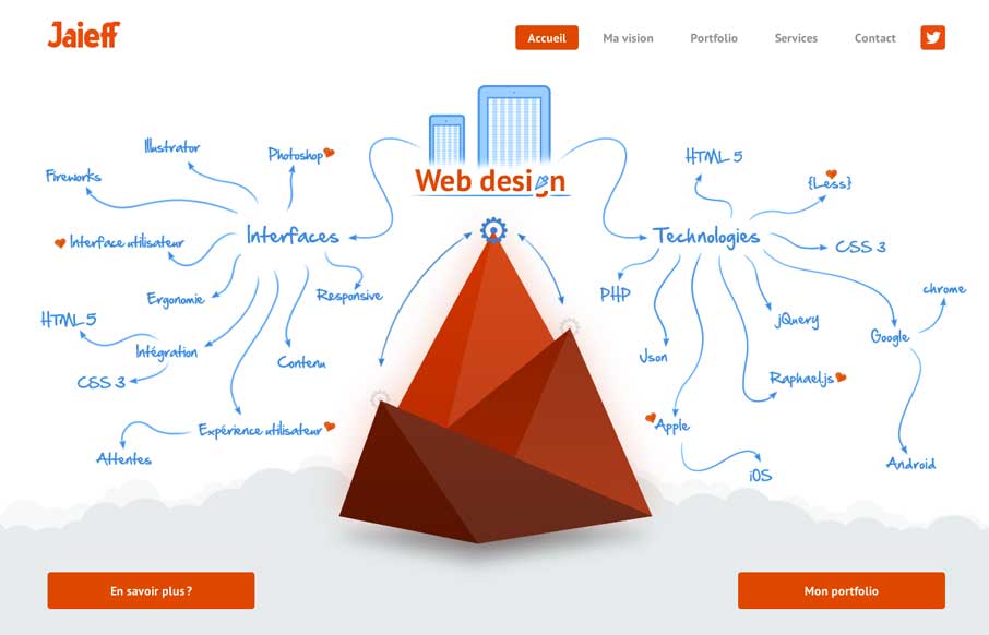
by Gene Crawford | Mar 7, 2014 | Gallery
There’s a lot to like about this website. But the best part is the interactive illustration on the home page. It’s pretty fun to mouse over that little gear and get all the arrows and stuff to show up. Also check it out on smaller screen widths, the stuff...
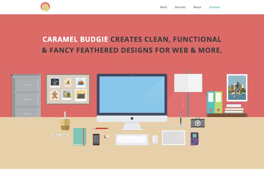
by Gene Crawford | Mar 6, 2014 | Gallery
Man I love these illustrations! Super slick and both clean and illustrative at the same time. I like that it’s a single page layout – that works pretty well for this instance. Enough eye candy and simplicity to get the site to work for them.
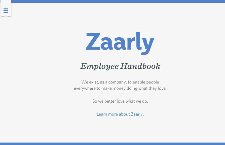
by Gene Crawford | Mar 6, 2014 | Gallery
Nothing super rule breaking about this but it’s become commonplace for companies to put things like their employee handbook or benefits info on a website or resource like that. The Zaarly Employee Handbook is just sexy. Nothing more needed to say about it other...