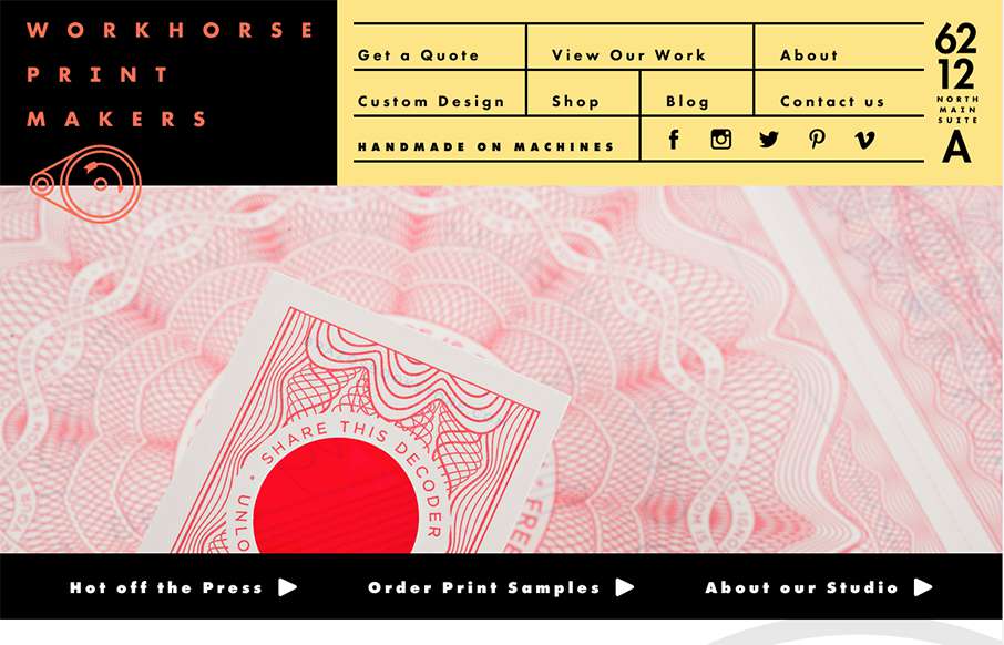
by Aaron Griswold | Oct 14, 2015 | Gallery
Hands down, the best navigation we’ve seen in a while in this site for Workhorse Printmakers, made by Spindletop out of Houston (think we’ve reviewed their site earlier this year too). Love this header nav block – definitely makes you think of a...
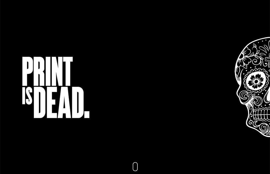
by Aaron Griswold | Oct 14, 2015 | Gallery
Very cool single page site done for Hadgins Engraving, by 15 Fingers out of Buffalo. Two colors, some illustrations, some good typeface, and a little interaction – very good. Especially like the “skull fashion plates” lower in the page. From the...
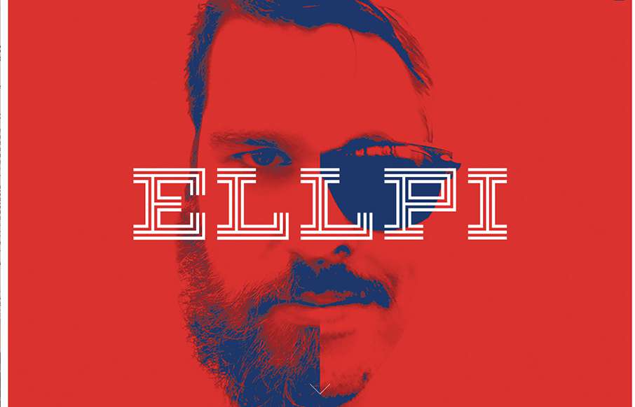
by Aaron Griswold | Oct 14, 2015 | Design Firm, Gallery
Cool looking red, blue and white agency site out of Montreal from Ellpi. It’s very simple and clean, with good white (red) space. I like how the video backgrounds on the site are not featured, they are more like footers on interior pages. From the Designer:...
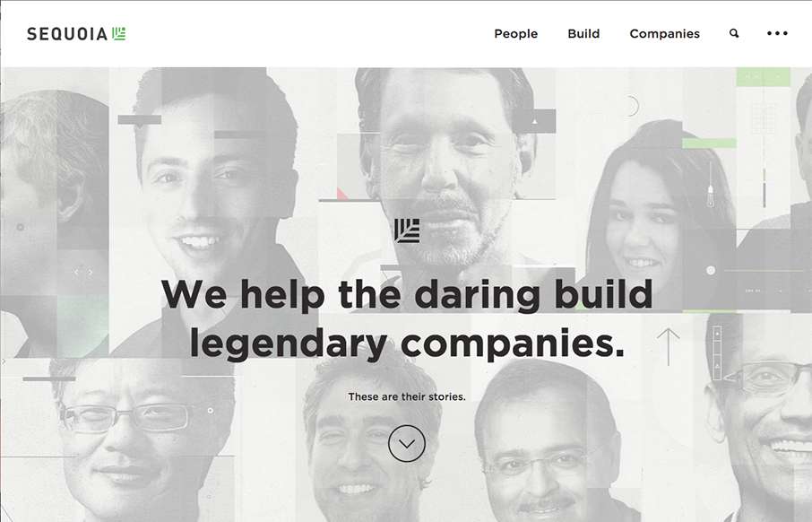
by Aaron Griswold | Oct 13, 2015 | Gallery
Sharp new site from Sequoia Capital out of Menlo Park. Like the intro image that leads down to the cool vertical slideshow, with great suped-up images, and a cool overlay on the left.
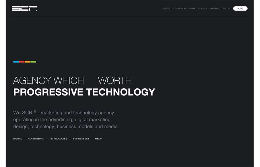
by Aaron Griswold | Oct 13, 2015 | Gallery
We usually don’t see many dark websites that really “work”, but the SCR agency site out of Slovakia makes a good case for it. Unlike other dark sites though, they have good, bold and bright colors to counter-balance everything. Like the collage /...